Principles & Elements of Interior Design | Part 1
ELEMENTS OF INTERIOR DESIGN | PART 1
The principles and elements of interior design are essential methods and tools for designing spaces as Chip and Joanna Gaines know. Some of the worlds greatest interior designers disregard the principles and elements of interior design and are praised for proving them wrong. However, unless you are confident in taking such risk, it is best to abide by the rules so that you too can create stunning interiors that sweep people off their feet!
In this article we will discuss the 8 elements of design: space, form (shape), pattern, line, light, texture, scale and color. We'll also dive into the 5 principles of design: balance, emphasis and focus, rhythm, proportion and harmony and unity but we are saving that for another article. You can view that here.
My approach is through the use of examples featuring Jonna Gaines design work from HGTV's, Fixer Upper, followed by a brief description of each principle and element of design as well as how it was implemented and why it made it difference!
OPEN SPACE ELEMENT
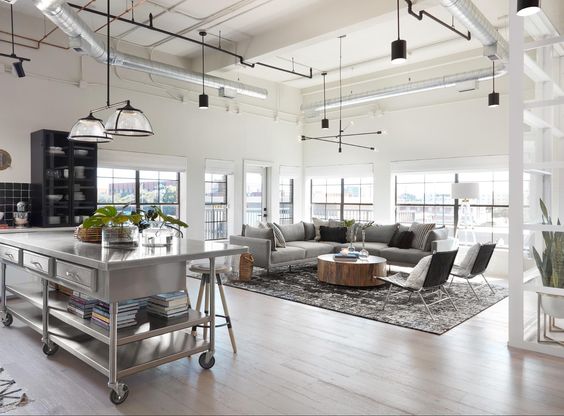
This image is from Fixer Upper Season 5 Episode 15, "The Home Sweet Home Loft."
In this space Chip and Jo created an open space concept by raising the ceiling and exposing the industrial elements within, while painting the walls a bright white. The black elements throughout create contrast and visual interest. Positive space is created through the use of furniture, decor and architectural elements such as cabinetry, while negative space is the unused space throughout. The varying tones of grey and the shape of the sofa bring visual interest to this living space accomplishing an equilibrium. Amazing work as always Chip & Joanna!
Closed Space Element
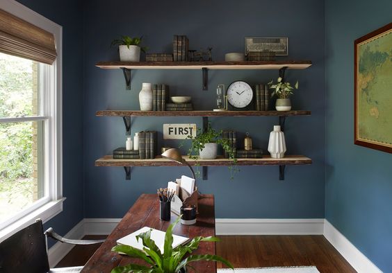
This image is from Fixer Upper Season 5 Episode 1.
This home office design by Joanna Gaines is a great example of a closed space concept. In this picture, the dark walls and furniture would be considered the negative space and in contrast, the neutral accent decor, trim and windows create an equilibrium of positive space. Some may find this dark room invites cozy and industrial vibes; while others may find this to be too too dark. I believe that this space maintains an equilibrium because of the contrast, scale of furniture and décor placement. Way to go Chip and Joanna!
SHAPE | FORM ELEMENT
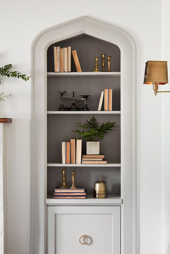
This image is from Fixer Upper Season 5 Episode 4.
In this picture we see the emphasis is on the these custom built-ins that originally came with the house. The added so much character to the space so Joanna hightailed this featuring by painting the walls a nice bright white and going a bit darker with the trim so that they really stand out. Its curvilinear form adds interest and drama to the space.
PATTERN ELEMENT
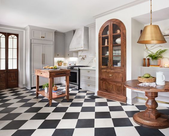
This image is from Fixer Upper Season 5 Episode 4.
In this beautiful kitchen, the focal point quickly becomes the black and white checkered tile bringing texture, pattern and emphasis to the space. By emphasizing this element, Joanna sweeps people off their feet with this added visual interest.
LINE ELEMENT
IRENE Tokstad
With a loving husband and three amazing kids, Irene is committed to serving and supporting fellow community families of all shapes and sizes by helping them realize their home vision with innovation, integrity and passion.
CONNECT WITH ME
Join our mailing list
- « Previous
- 1
- …
- 4
- 5
- 6
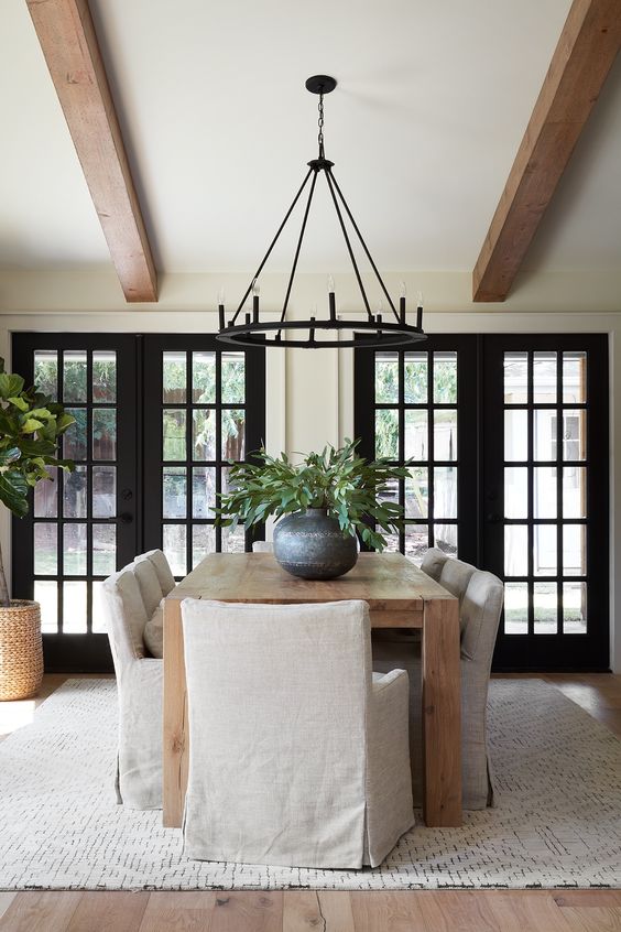
This image is from Fixer Upper Season 5 Episode 5.
Let me wipe my drool real quick. OK...
As you can see from this gorgeous dining space, you can incorporate lines in your design through the use of architectural elements in the room. Through the use of beams, molding and even shiplap you can create texture and visual interest. Interestingly, lines guide the viewers eye through the room.
How stunning are these french doors leading out the back? And those beams?!?! The whole thing, I love it so much!
LIGHT ELEMENT
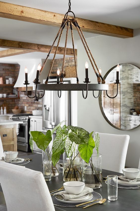
This image is from Fixer Upper Season 5 Episode 3.
In this picture the focus is on a unique, metal chandelier. This task lighting element sets the ambiance in this dining space, by becoming the focal point. Its setting is high enough so as not to black people for conversations but low enough so that it doesn't get lost being too high up. Whether its ambient (general lighting), task lighting, accent lighting, or natural light, DONT skip this step in design! Its critical and Joanna knows this.
TEXTURE ELEMENT
This image is from Fixer Upper Season 5 Episode 3.
In this space we see a lot of texture. The textured stone accent wall becomes the focus in this kitchen adding visual and tactile texture to help visually balance this Fixer Upper home.
SCALE ELEMENT
This image is from Fixer Upper Season ? Episode 13.
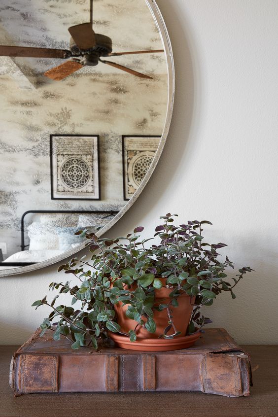
This image highlights the scale element with this large oversized mirror above the dresser in the bedroom. The scale of the mirror is fitting as the dresser is long. You would want to place a small mirror or art work above this large pieces of furniture as it would prove to be appropriate to scale. I'm Joanna would agree!
Color Element
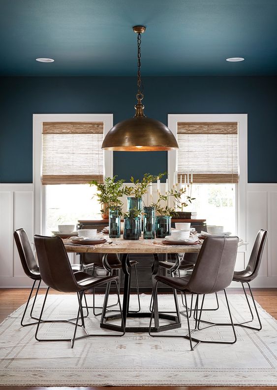
In this lovely dining space we are pleased by the playful jewel toned hues. The natural shades offer balance and much need texture while the incredible brass dome light fixtures offers the appropriate task lighting while also becoming the focal point in the space tying the various elements together creating an equilibrium in this space. Incredible work Chip and Joanna!
THANK YOU
Thank you so much for reading this blog and we hope you found it relevant, inspiring and helpful! Remember there are principles to abide by in interior design and it is critical to understand these in order to create an equilibrium.
Stay up to date on the latest trends & tips
FOLLOW US ON SOCIAL MEDIA
Get the latest updates on hot trends, tips and tricks and short stories of our projects!
