Home Staging | Lake House Dreams
Sold: In 2 Days for Asking Price
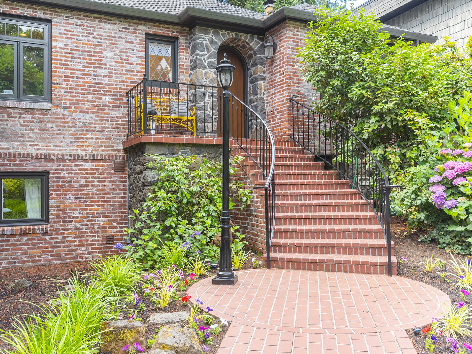
Address: 340 Ridgeway Road, Lake Oswego, OR 97034
Realtor: Alex Phan, Phan Hall Property Group, Keller Williams Realty Professionals
LAKE HOUSE DREAMS
In this luxury home staging we worked with some existing pieces staying in the home while listing and advised on the rest that should be removed removed for staging. Rule # 1 in home staging design is to honor the architectural elements throughout, along with the existing pieces in the space. At times certain pieces must stay in the home while it's listed and so it our job as professional home stagers to give the home an updated and fresh look all in an effort to appeal to the most amount of potential buyers.
I'm proud to say that is just what our Lake Oswego Home Stagers did and we couldn't believe the results! This home was listed for $2,230,000 and it sold in a 1 day. It's not surprising as Alex Phan and his team at PhanHall Property Group know exactly how to market a high end listing such as this dreamy lake house in Lake Oswego, OR.
PROFESSIONAL HOME STAGING TIPS
It's important to know that when you're staging a house for a high-end market like what we are seeing here in 2018, it's different than other target markets. In these high-end luxury homes, there’s a lot of detail in the architectural elements throughout. In this home specifically, it went beyond great crown molding and a magnificent fireplace, we worked as a team to showcase the homes ASSETS such as the top of the line chef's kitchen and incredible patio, yard and boat house too.
When it came to picking our furnishings and decor, we knew we couldn't go cheap, (not that we ever would), because it would take away from the lifestyle appeal of the home. So our goal was to enhance the homes best features by bringing in timeless classic pieces with more of a transitional look in an effort to get the home sold for the most amount of money in the least amount of time.
Formal Dining Room
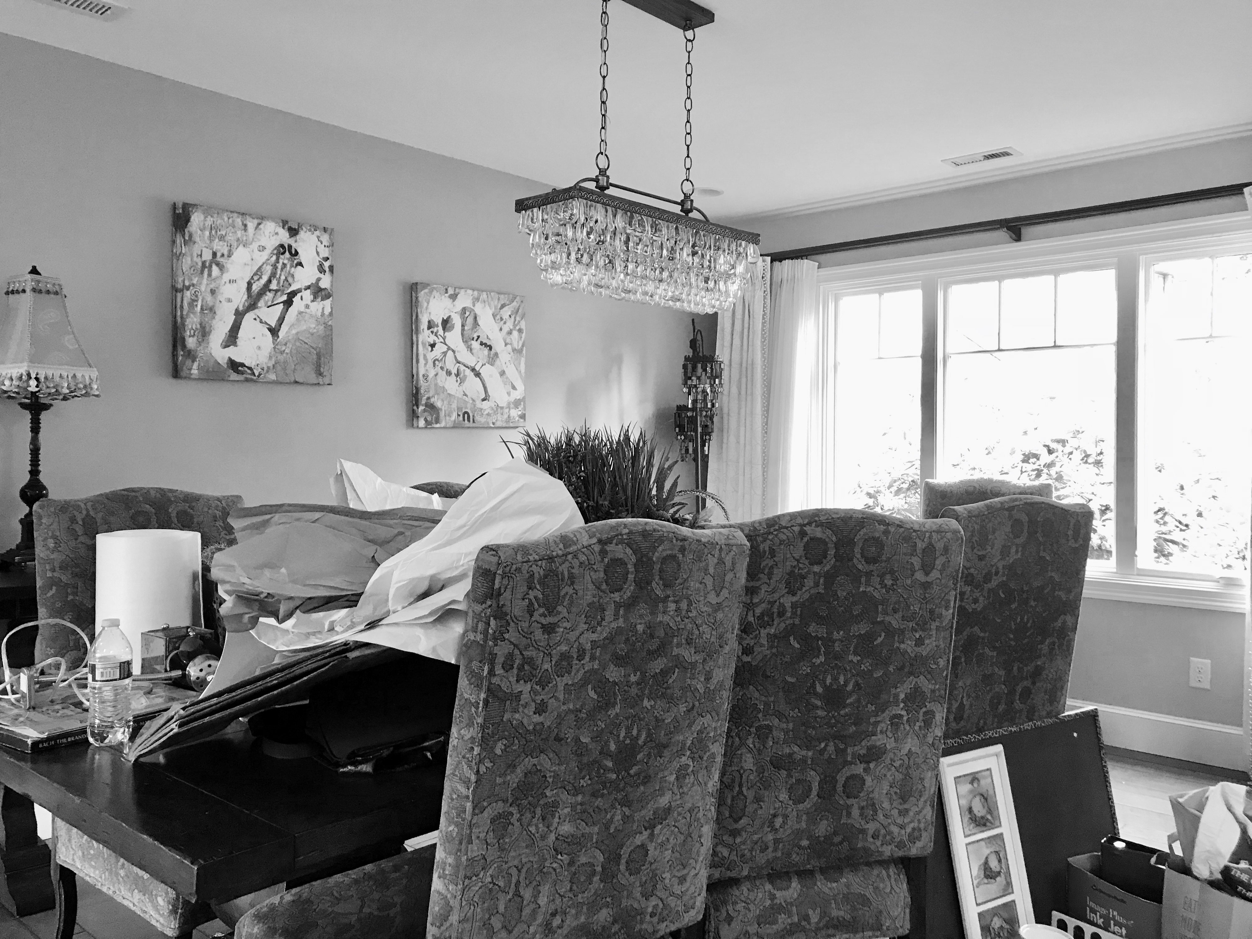
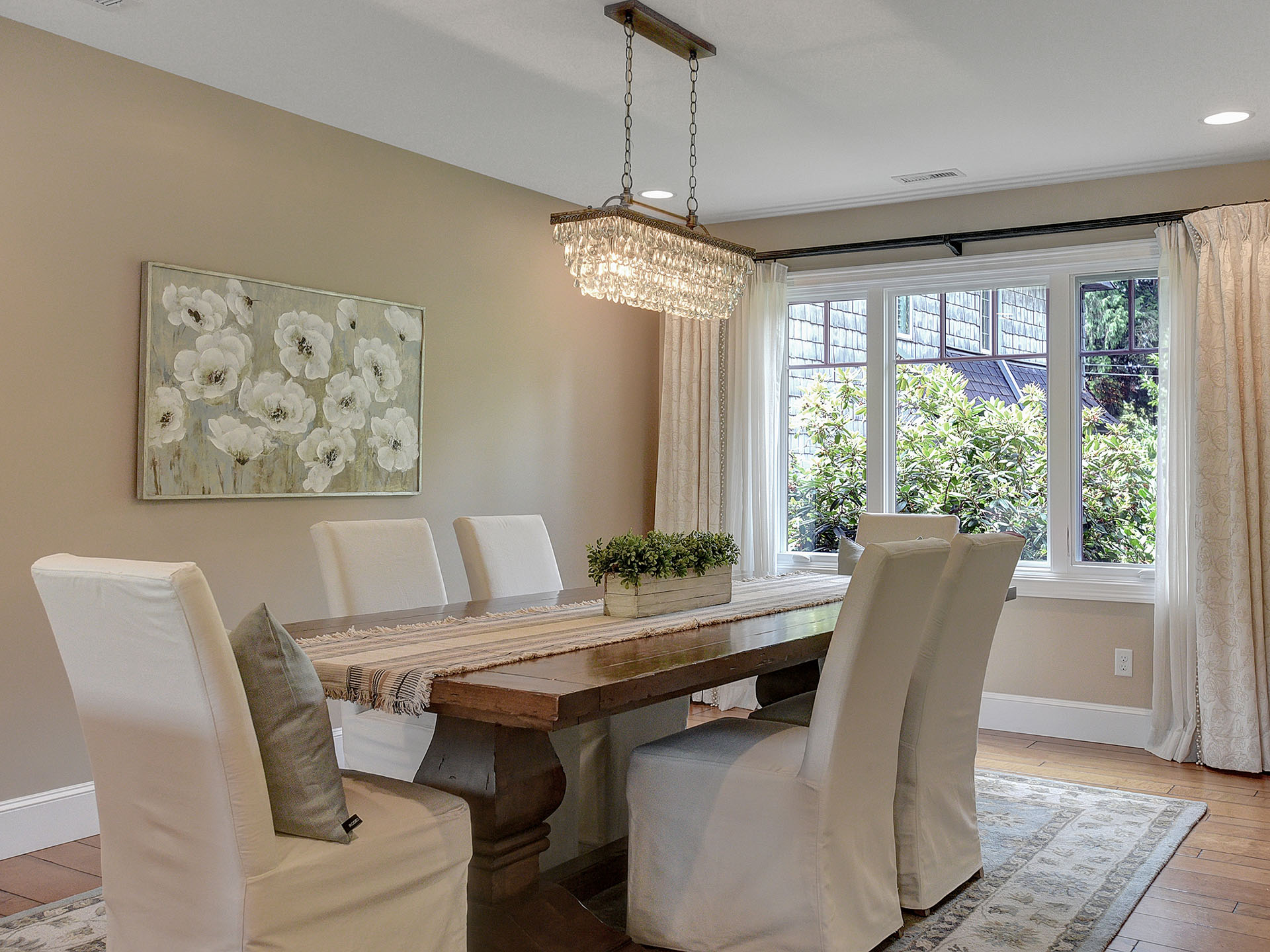
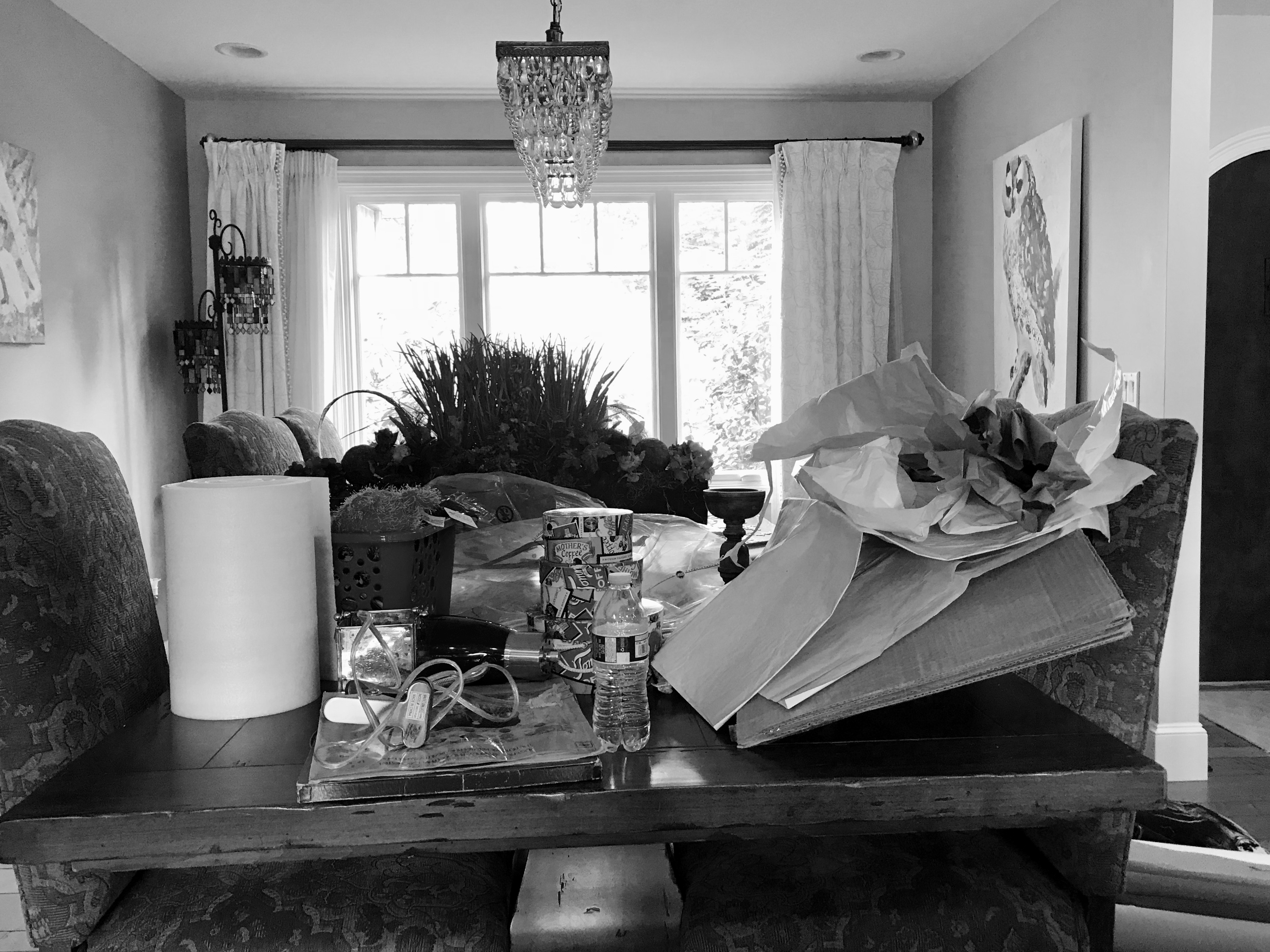
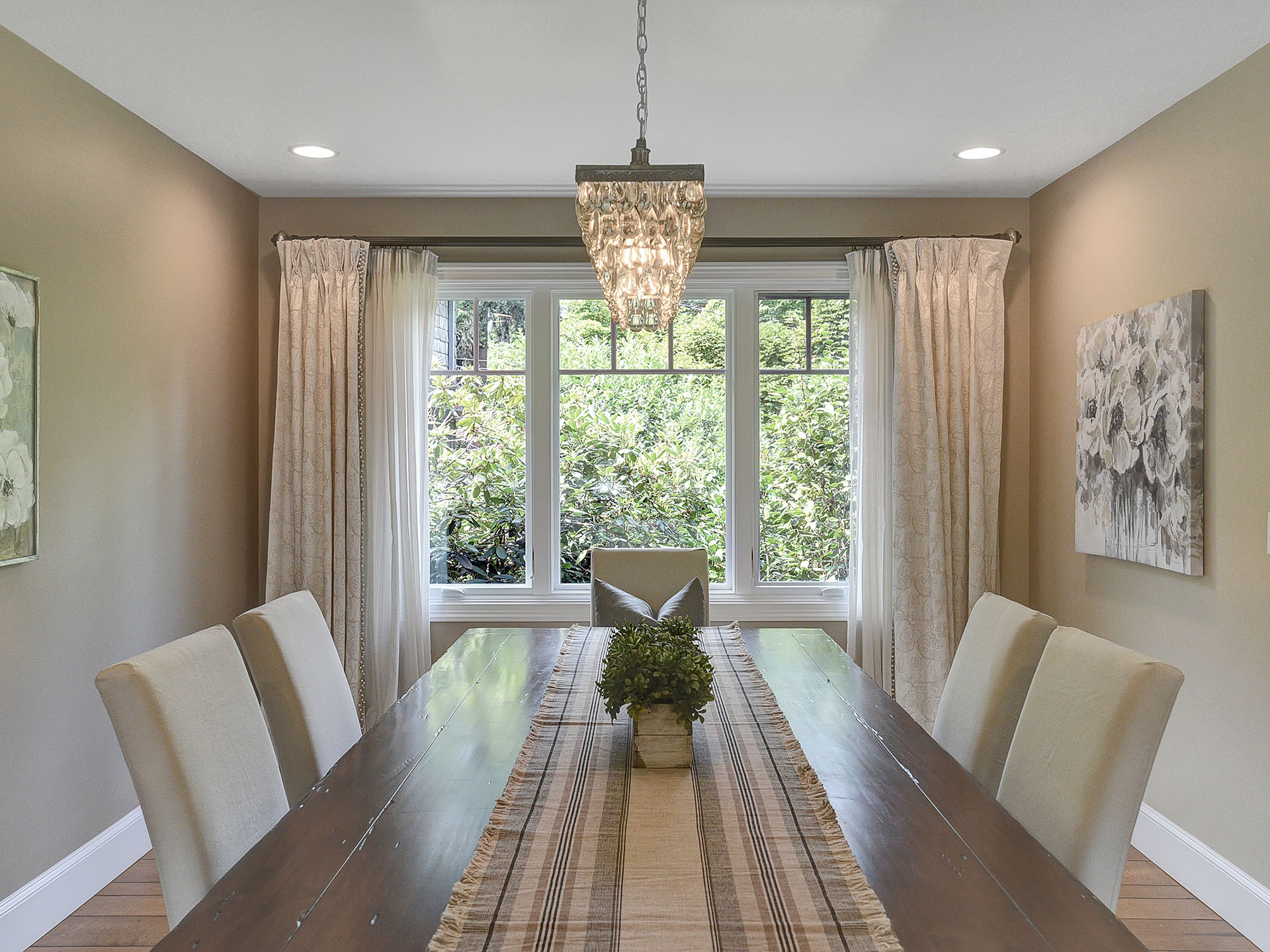
Stepping into the foyer, immediately on the right we are greeted with an open dining room. The dining room is large and the table is too. Overall though, it is a flexible space to work with. The walls are a beautiful neutral greige; and the windows featured custom drapes that enhanced the light and bright semi-coastal theme I immediately know we were going for.
I advised the client remove the current wall art featuring owls and upholstered dining chairs featuring a green paisley pattern so that we could bring something more neutral in style and taste in order to give the room a fresh look.
We decided to compliment the custom drapes with light and bright slipcovered dining chairs in an effort to create a stunning and relaxing scene. Our home stagers added the area rug in an effort to anchor the space and frame the focal point (the dining table). The art work compliments the colors of the Persian rug as well as the colors of the home. When everything came together it was complete and harmonious and I'm so proud of the turnout!
PROFESSIONAL HOME STAGING TIPS
If your dining room isn't really standing out try using a runner and centerpiece! It's the best way to create visual interest in a space that otherwise doesn't have very much going on.
Unless your space is overcrowded of course. Remember, sometimes less is more. In the case of this dreamy Lake Oswego home Staging, we removed a lot and didn't bring a ton back in because we wanted to highlight the homes function and flow.
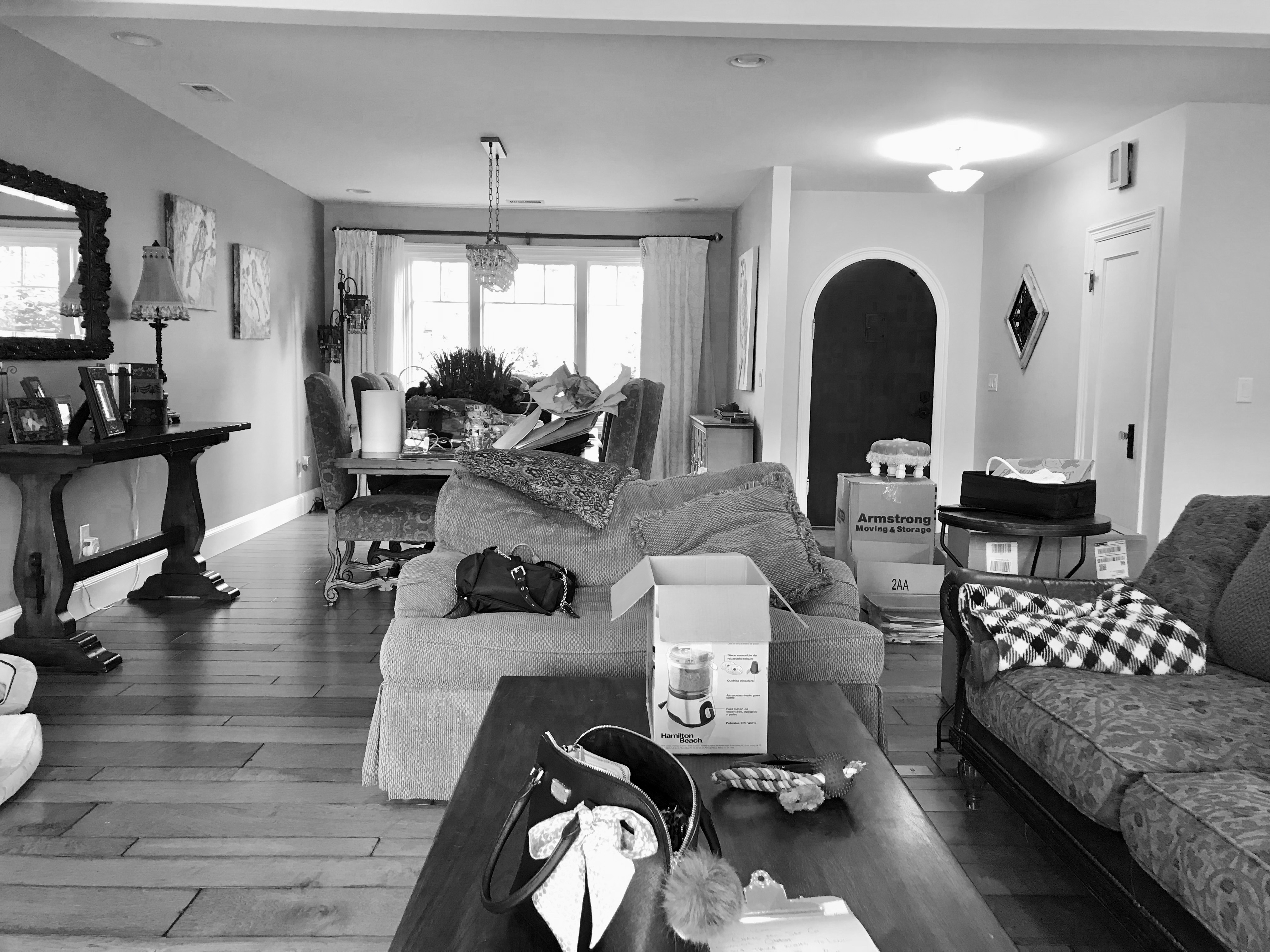
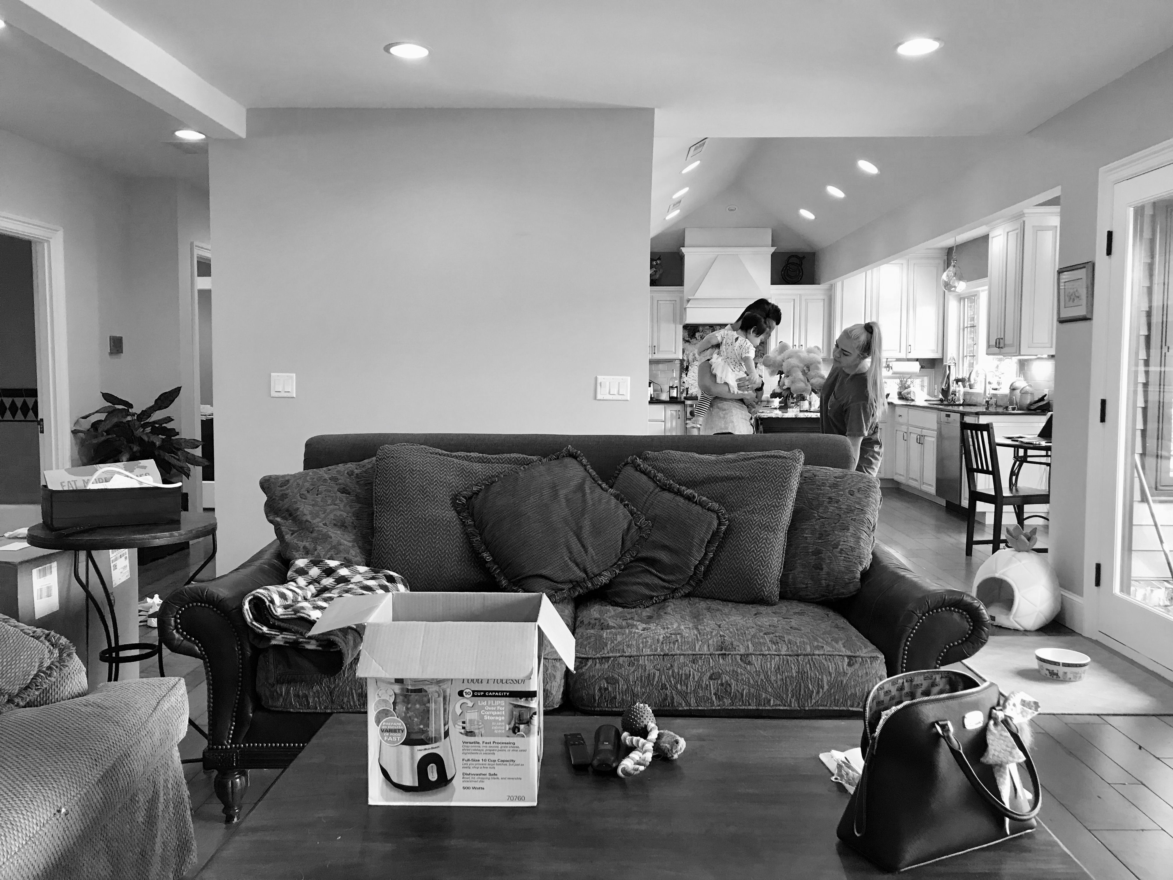
Make sure to have an area rug under the dining table. This is the best way to frame your space and really make it stand out against the rest! It'll photograph really well too; and that is key because your listing photos will be your prospective buyers very first impression. Check out our before and after photos below!
Check out our article on home staging tips you should know here!
LIVING ROOM

IRENE Tokstad
With a loving husband and three amazing kids, Irene is committed to serving and supporting fellow community families of all shapes and sizes by helping them realize their home vision with innovation, integrity and passion.
CONNECT WITH ME
Join our mailing list
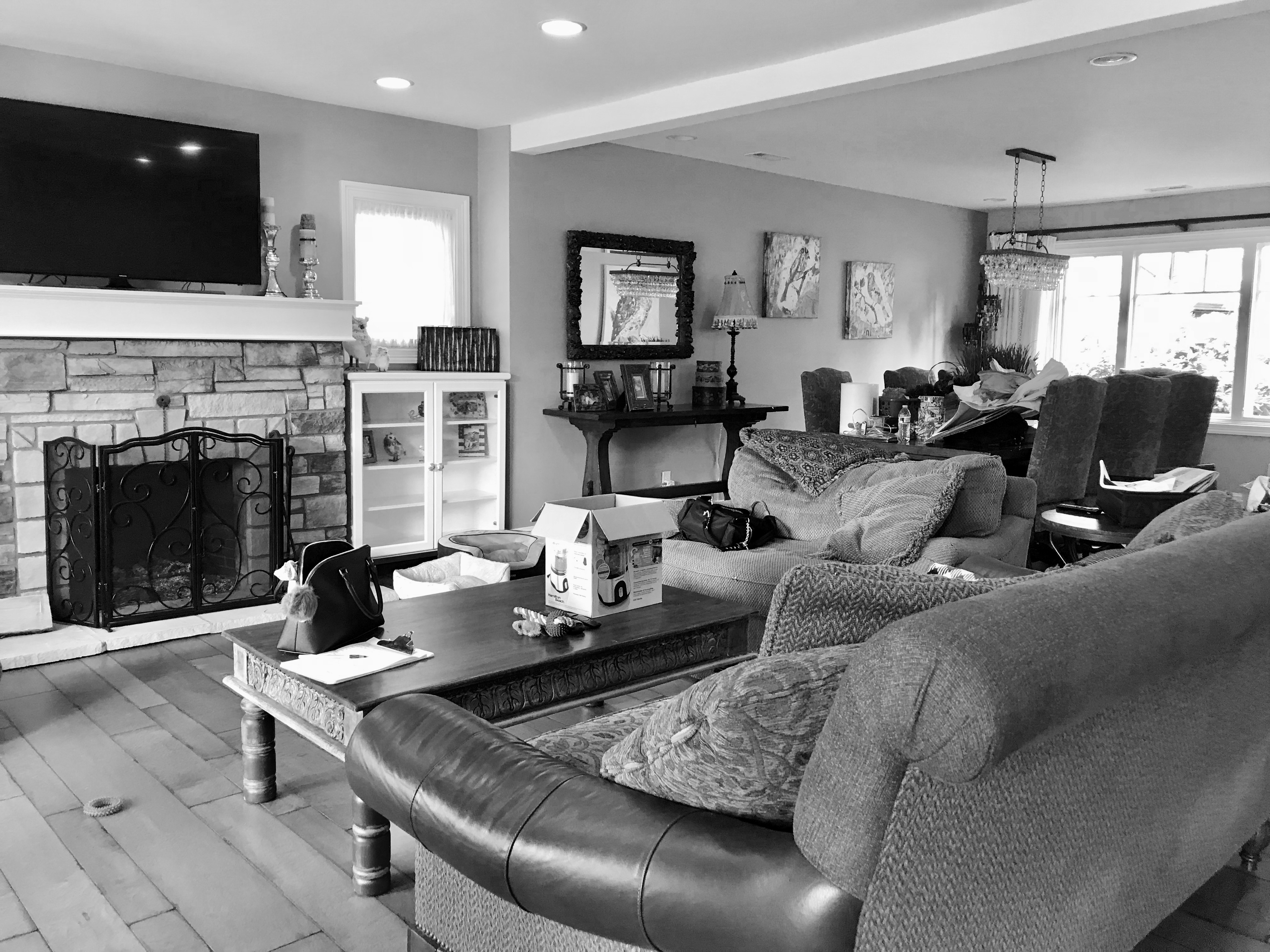
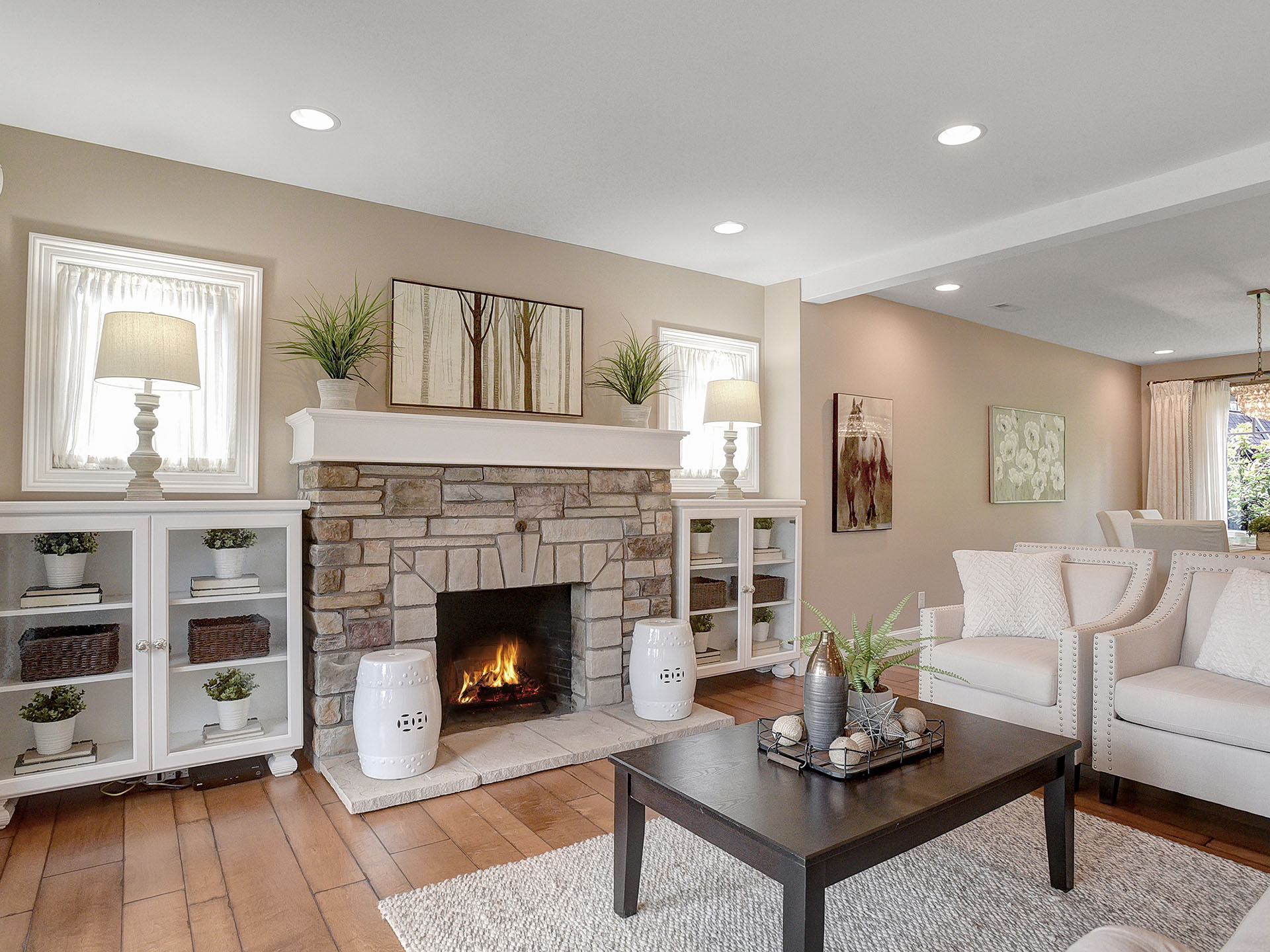
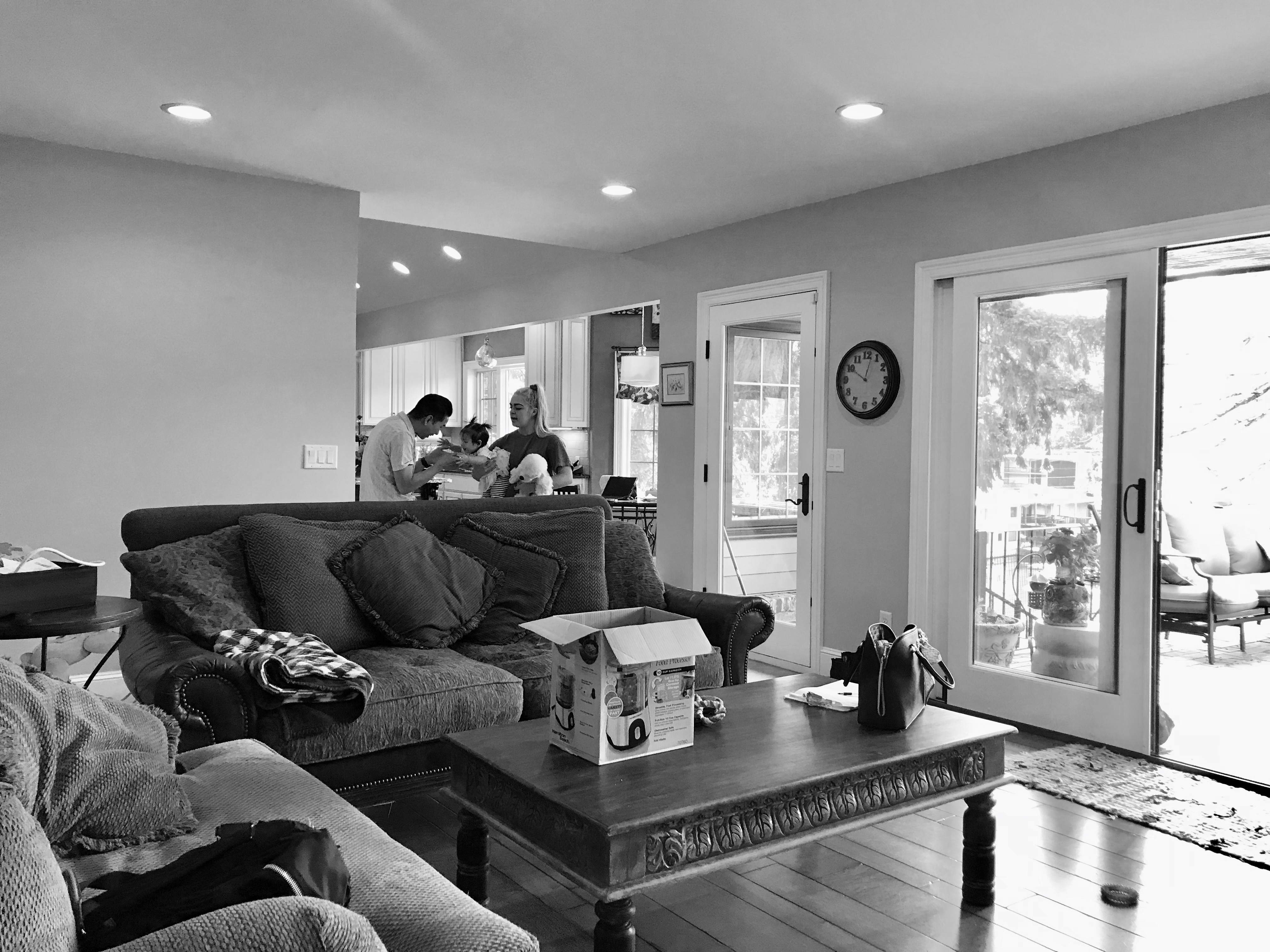
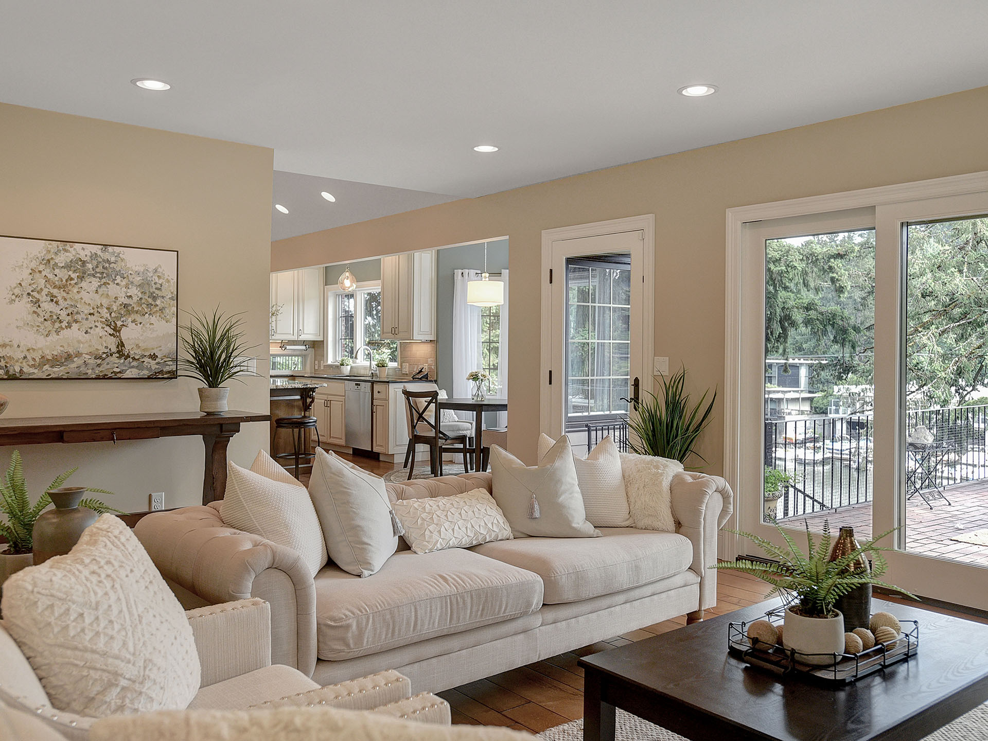
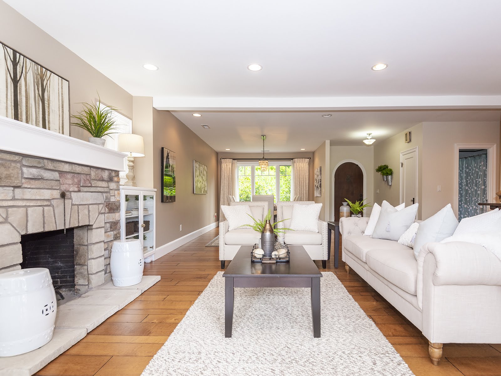
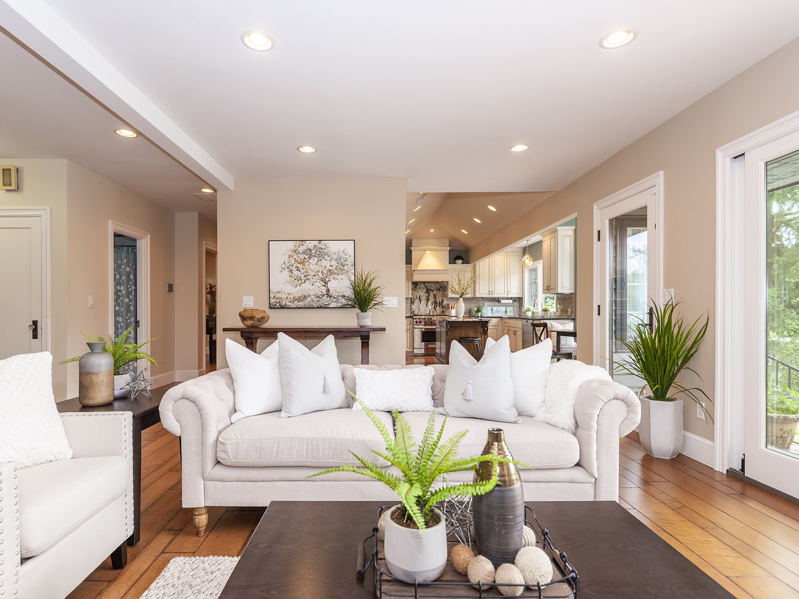
Straight ahead when coming through the foyer, you are greeted by the living room and a dreamy view beyond the panel glass slider and windows. In the living room we complimented the light slipcovered chairs by brining in neutral colors with accent chairs and decor in an effort to create visual interest and really let the fireplace pop. The natural light along with plenty of recessed can lighting brightens this space and literally makes you feel alive. The transitional Chesterfield sofa was key in this space and the results were stunning!
The woven wool rug warms the space while also defining the conversation area. The seating arrangements highlighted to prospective buyers how many people can be hosted at one time in the space which is always a huge selling point.
PROFESSIONAL HOME STAGING TIPS
When staging such large luxury high-end homes, larger pieces can create a feeling the space is smaller than it is. Sometimes this isn't a bad thing if you have the space for it. Be careful though, you certainly do not want to overcrowd the house either. Maximizing space is important but remember, cluttered homes that you can't move around comfortably in will likely turn perspective buyers off.
In styling the coffee table for a staging its important to keep your display balanced. Nothing makes for a cluttered surface faster than a large collection of small knick-knacks. In contrast, displaying only large items can look excessive and awkward. To keep your coffee table balanced, vary the scale of display items and stack or group like objects together. Adding organic elements such a floral displays adds visual interest and height. Try imagining a visual triangle, it doesn't matter what shape you triangle is, it's just sure to look great if you use this formula!
Kitchen & Dining Nook
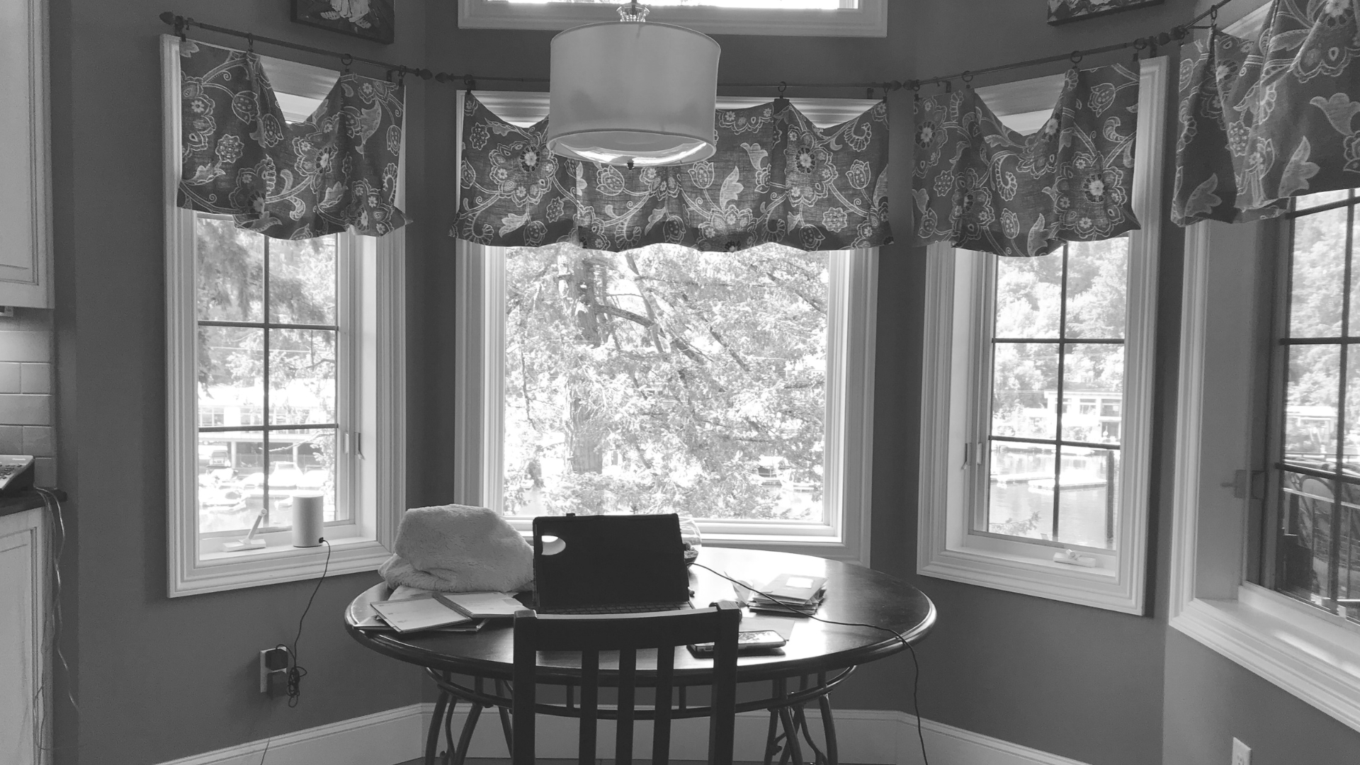
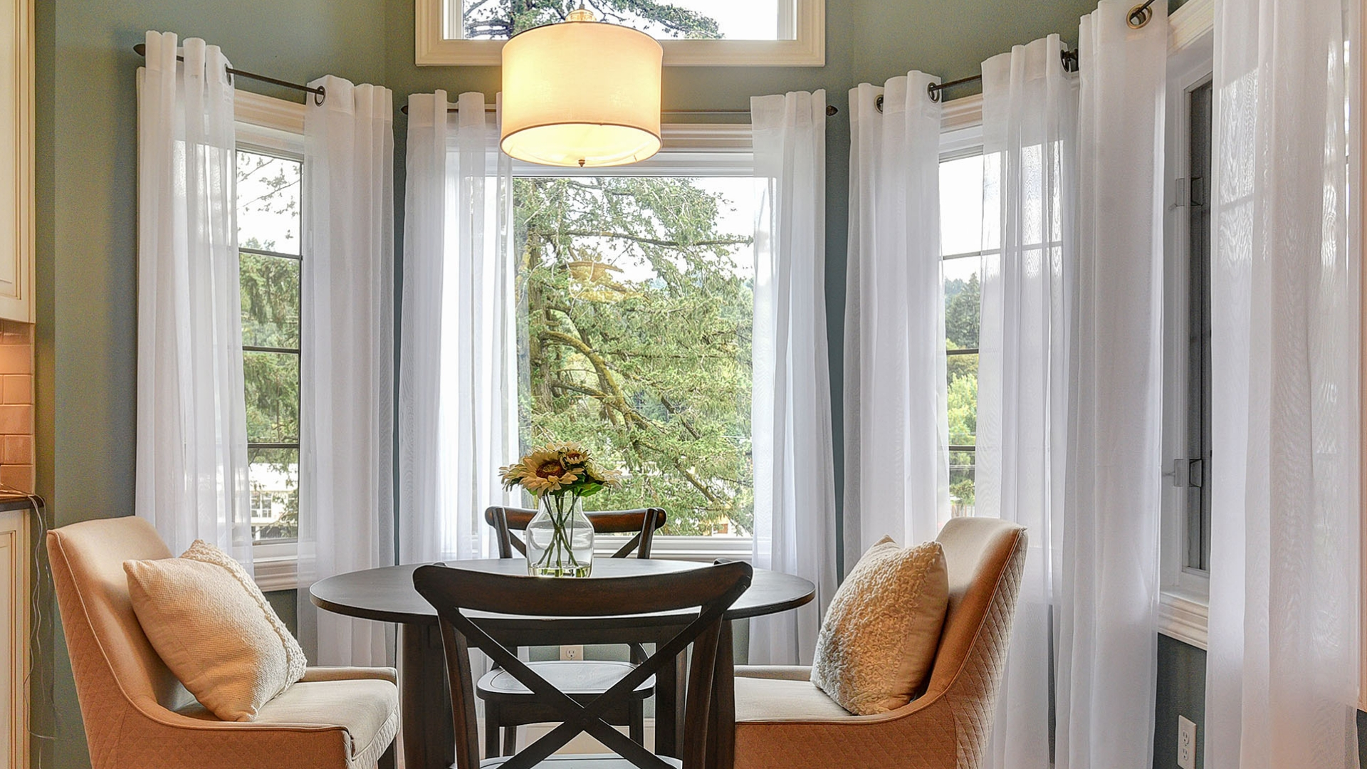
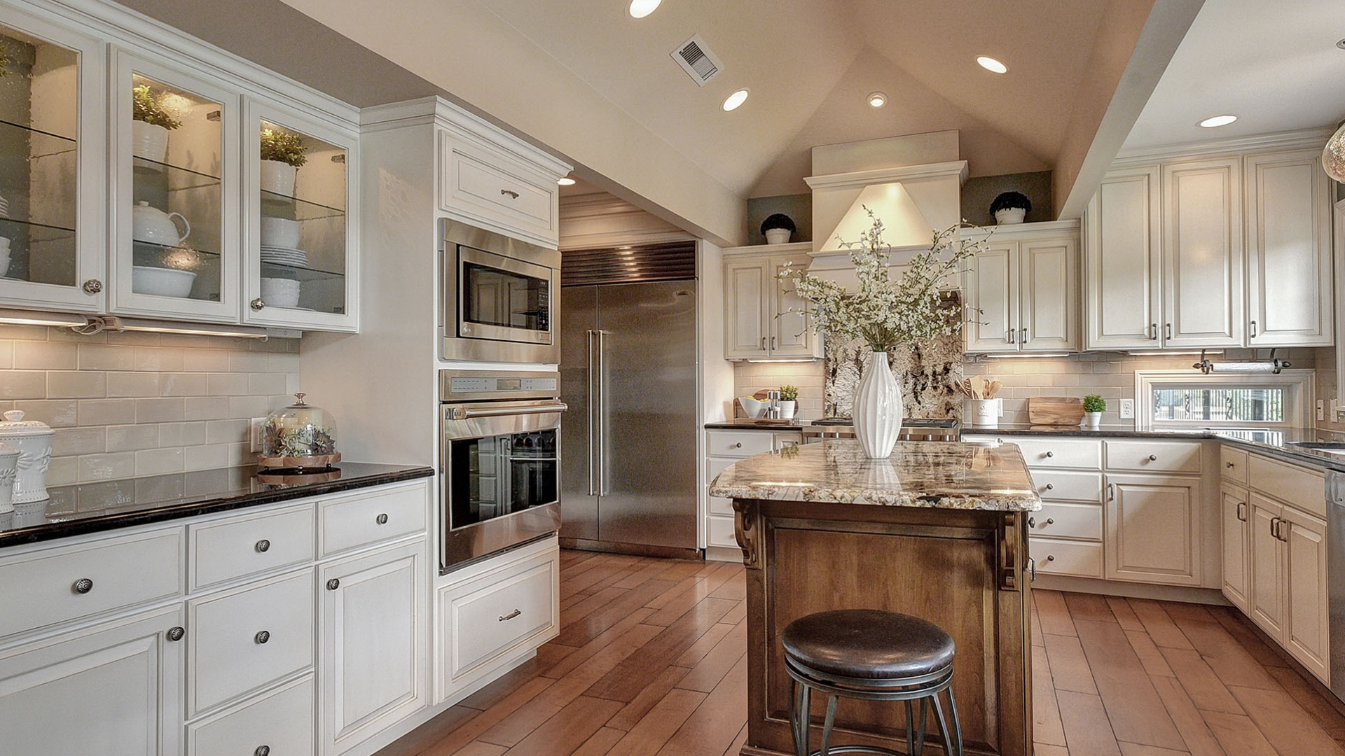
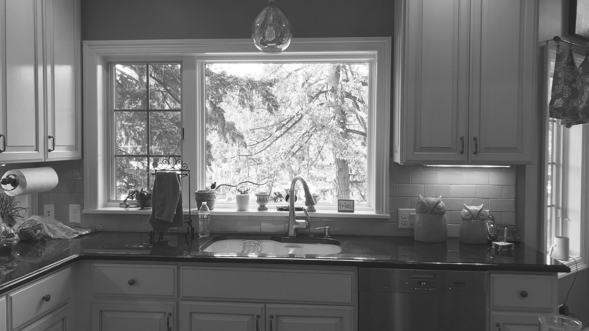
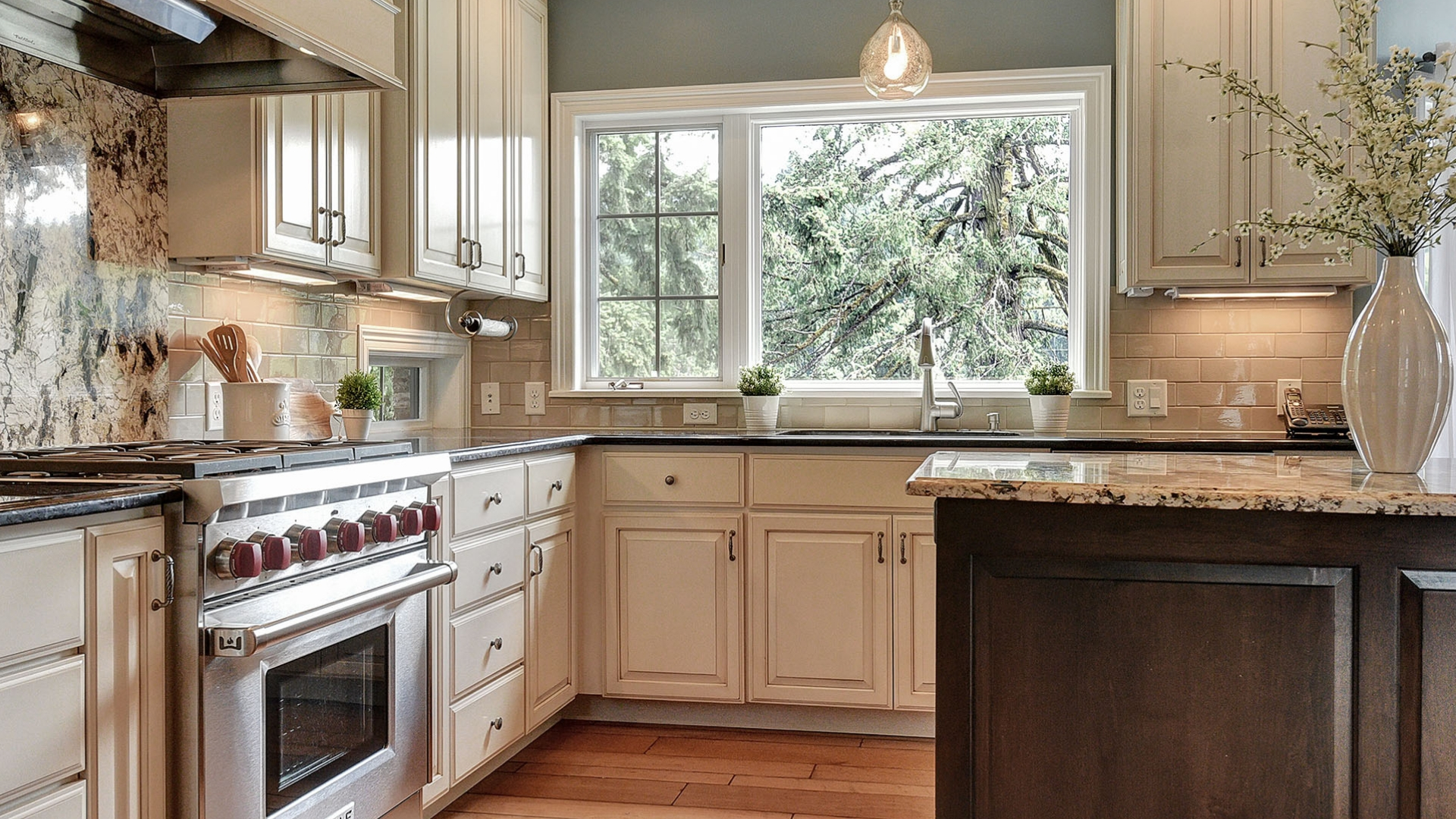
Design Allure sets the scene with carefully chosen pieces for emphasis. We didn't want buyers to be distracted by small details cluttering the space. You wanted the kitchen and dining nook to look alluring and charming, all while not taking away from the space. We added the beautiful sheer drapes to allow for as much natural light as possible while also adding to the elegance of the home and space.
PROFESSIONAL HOME STAGING TIP
In home staging, sometimes less is more. Keeping your counters cleared and free of debris and clutter is key when showing your home to prospective buyers. It will show them that there is plenty of counter space for cooking and such. This is a key selling factor for most prospective buyers!
MASTER BEDROOM
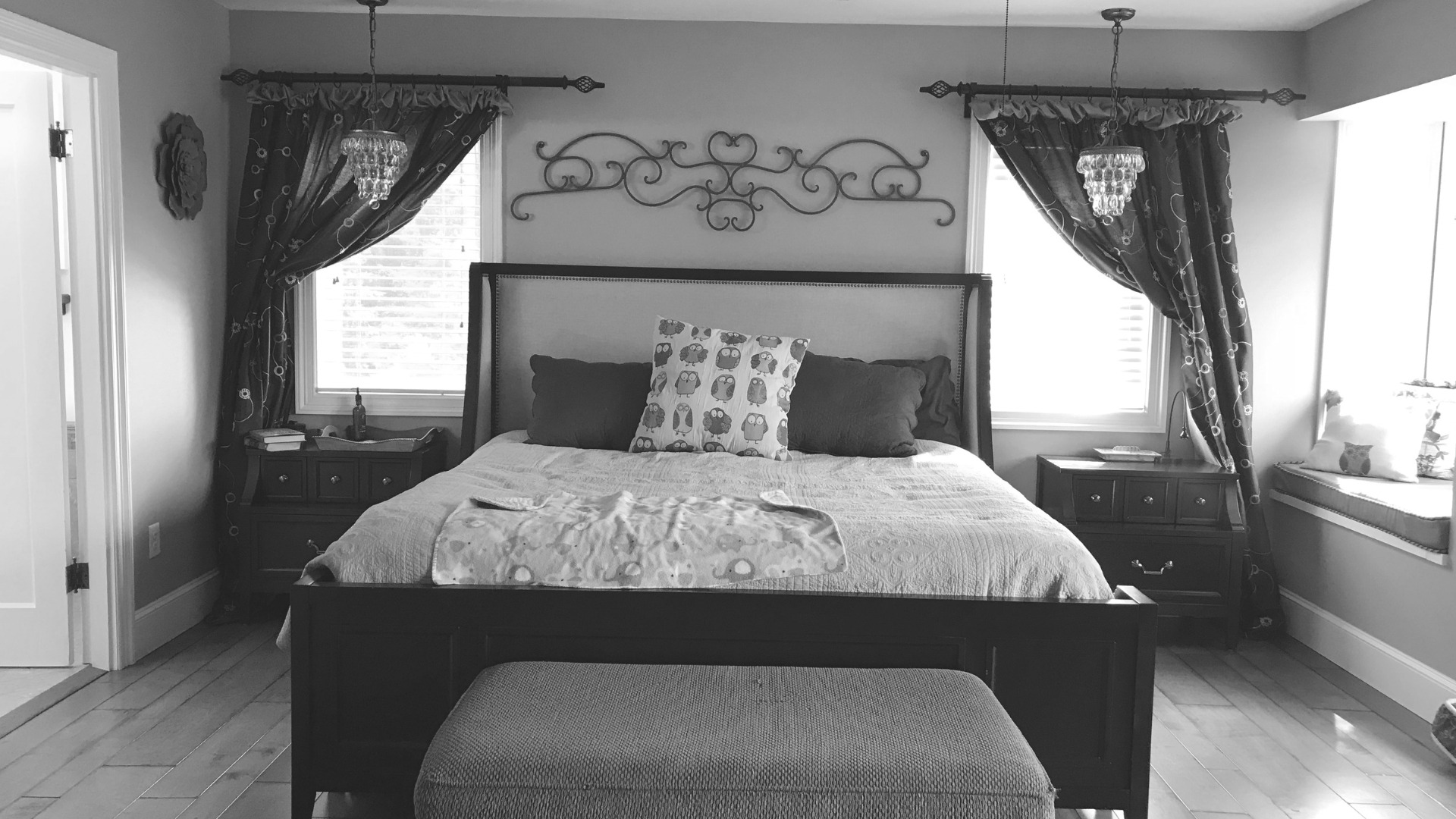
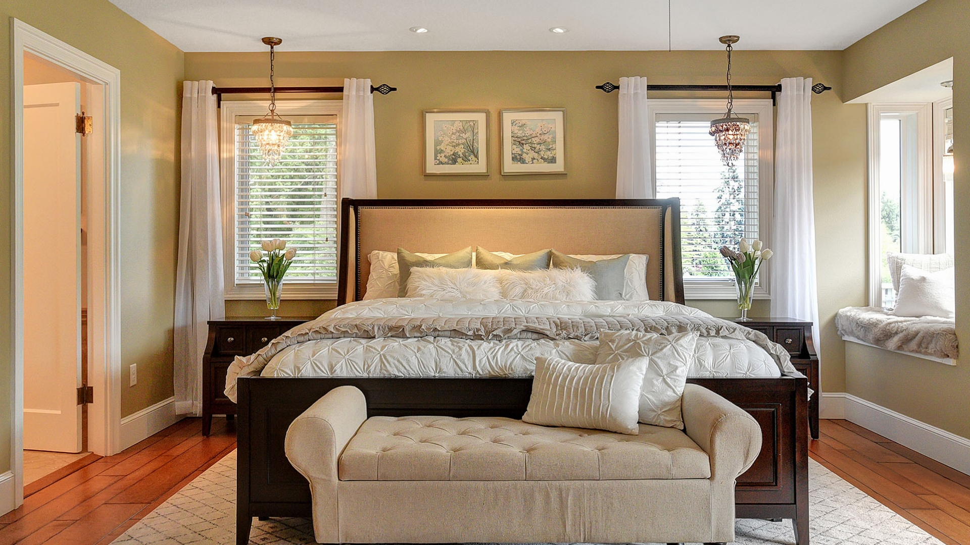
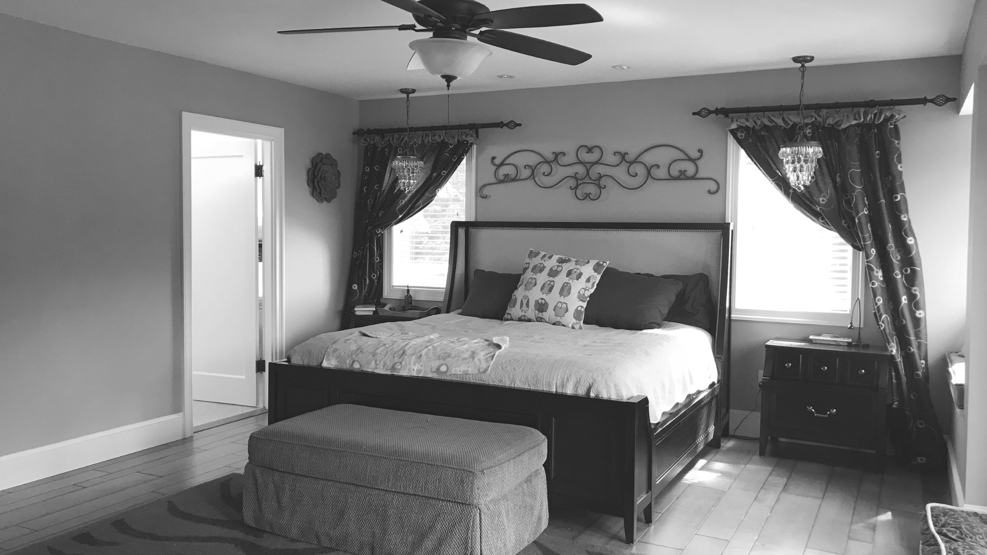
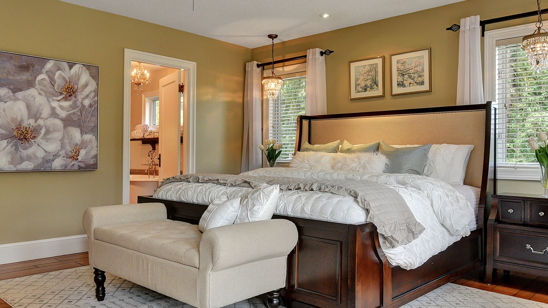
In the master bedroom you are greeted with a stunning neutral palette. The paint on the walls making this space trendy, light and bright. The space was large so we kept the king size bed in effort to appropriately accommodate the hanging pendants over the nightstands. The seating nook in the corner is dreamy and has a stunning view of Lake Oswego. Can't you just imagine sitting and enjoying a great book while sipping on some tea?! We complimented the wall color with neutral bedding and throw pillows in a subtle way so as not to lose emphasis or overpower the space with too much color and we sort of nailed it. When I look at these photos, I think of The Nines Luxury Hotel!
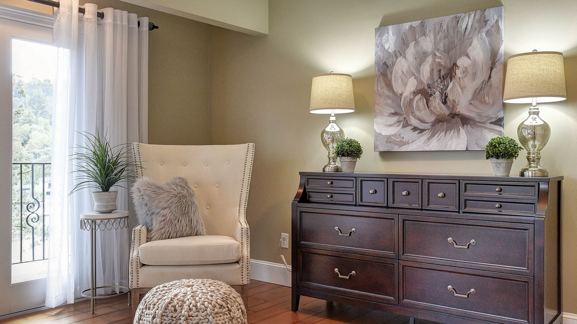
We added an additional oversized accent chair to appropriately fill the empty corner in the room. We set the stage with simple accents and engaging art for emphasis in this luxurious space.
PROFESSIONAL HOME STAGING TIPS
Warm your bedroom with an accent rug. It provides contrast while also defining the focal point when entering the space.
When choosing art for your wall, the artwork should be ½ – ¾ the width of the selected space. This is especially true when you are hanging art over a piece of furniture such as a long dresser. Interior designers abide by the principle in an effort to create harmony and balance. Also note that art best features in listing photos when you hang it lower. Not too low and not too high either. When in doubt, feel free to reach out to us here at Design Allure!
Home Office
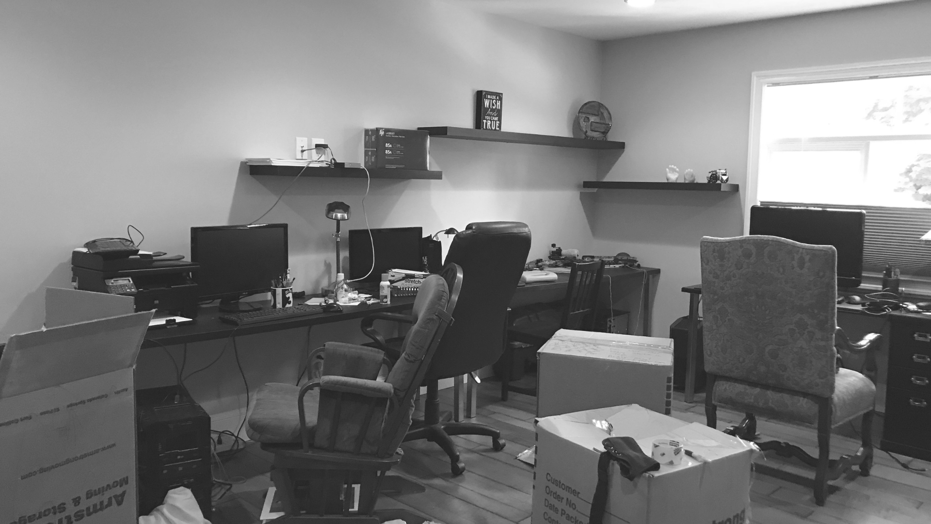
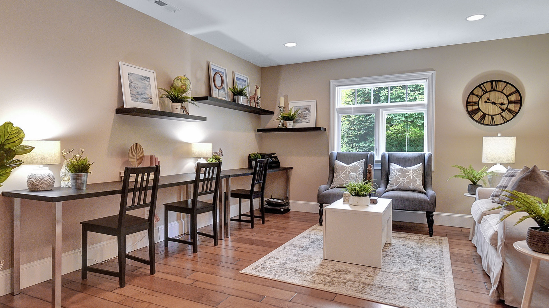
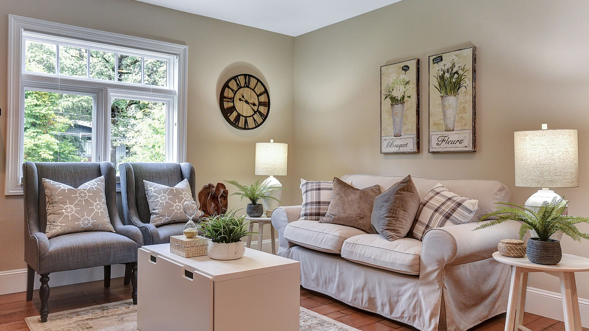
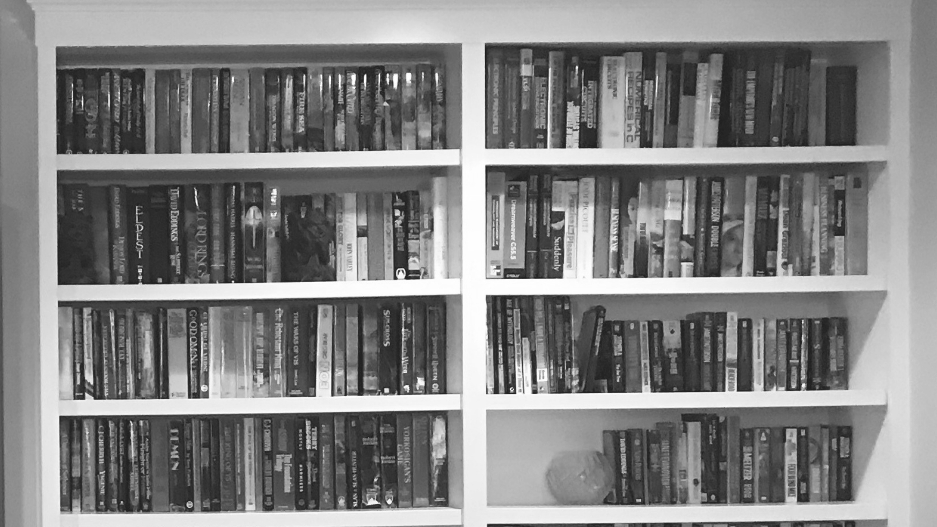
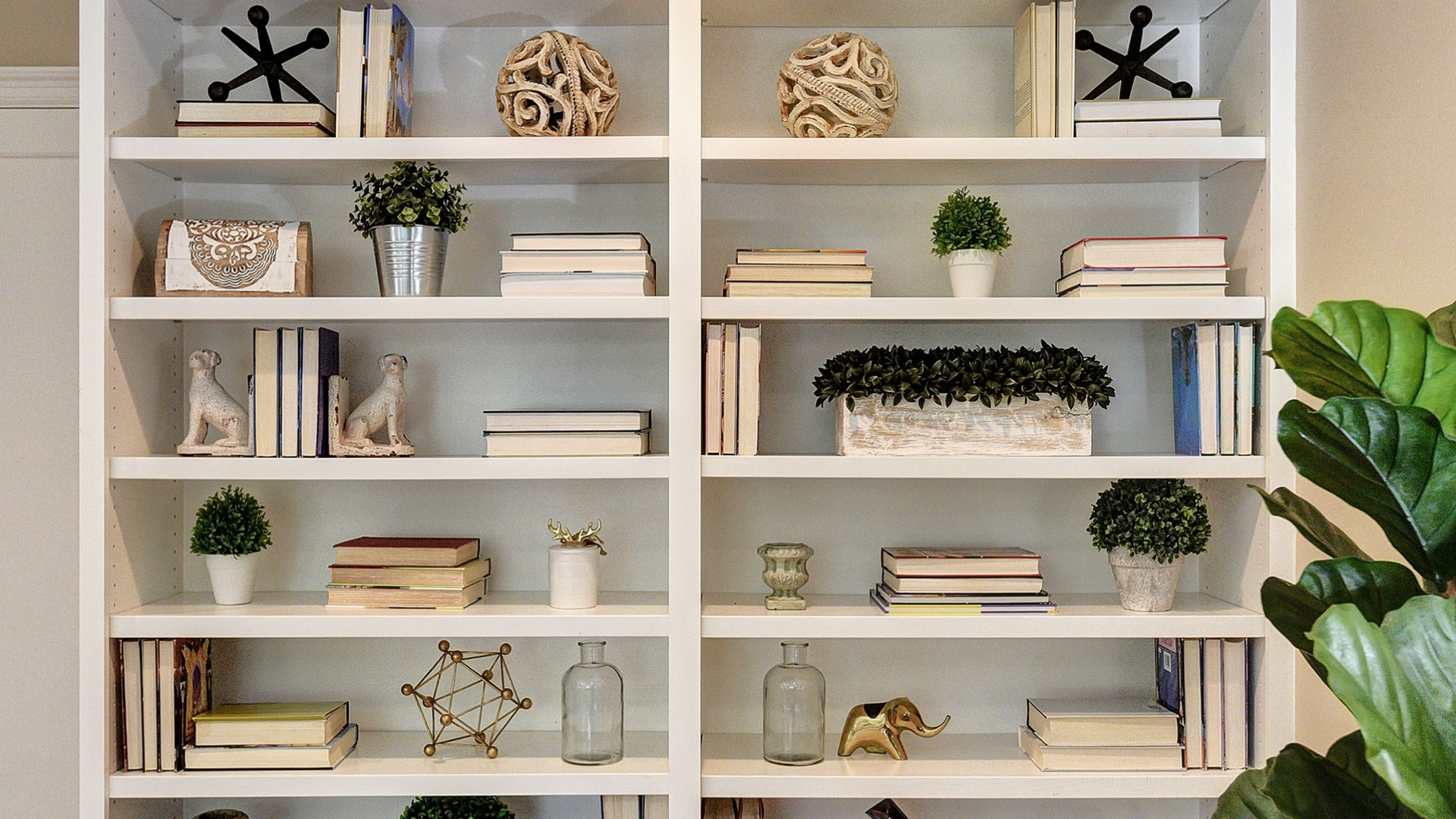
The office was a long and narrow space and it was large too and so in an effort to showcase it best to the most amount of prospective buyers, we really wanted to feature how the space could be used for multiple reasons and/or functions. In order to do this we created a seating area with a sweet toy chest also acting as a coffee table. Simple, yet perfect. In addition, we worked with the home owners desks by setting them side by side creating, multiple work/homework stations. We staged up the existing shelves by adding framed art and cute little pieces of decor. Lastly, we made a huge impact on the built in shelves featuring and eclectic display incorporating both our pieces from our Design Allure Collection and the homeowners. What a turnout too!
PROFESSIONAL HOME STAGING TIPS
When staging open shelving create visual interest by not over packing the shelves with too many books! This is key to creating a beautiful display! If you have lots of books, take the paper wrapping off and remove the soft covered books. Then colorize the shelves with complimentary colors so that you can create a beautiful display.
Thanks for checking out our project!
Thank you so much for checking out our latest project! We are so proud of the results and couldn't be more happy for the previous home owners. As many professionals working in this industry know, often times high end listing such as this home often sit on the market for some time because there aren't many buyers out there ready to drop $2,230,000 on a home! This was a huge win and I'm certain staging made all the difference! Please feel free to reach out to us here at Design Allure for any questions you may have regarding prepping your home for sale! We're always here to help!
Stay up to date on the latest trends & tips
FOLLOW US ON SOCIAL MEDIA
Get the latest updates on hot trends, tips and tricks and short stories of our projects!


