Home Staging | SE Portland Delight
Sold: In 2 Days Over Asking Price
Address: 7136 Mall St. Portland, OR 97206
Realtor: Jennye Helzer, Red Door Realty, Keller Williams Realty Professionals
SE PORTLAND DELIGHT
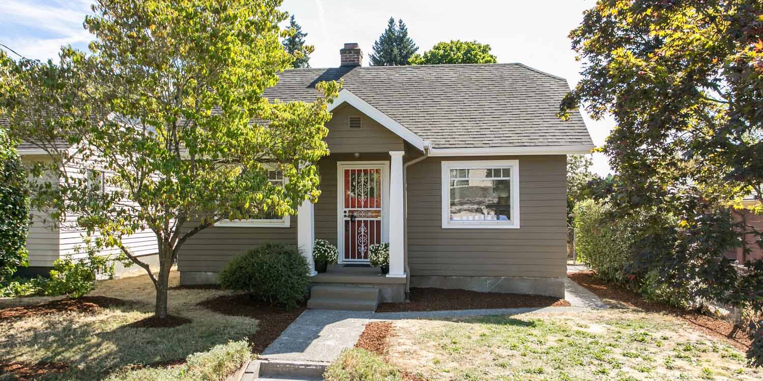
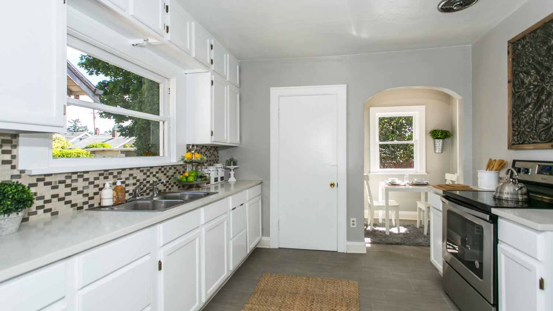
Compliments to Jennye Helzer, Realtor & Owner of Red Door Realty for knocking it out of the park remodeling this beautiful bungalow in SE Portland! It's amazing what a fresh coat of paint can do! Prior to staging this SE bungalow major updates were executed. The floors were refinished, the kitchen was brought back to life with fresh white painted cabinets, new quartz countertops and a beautiful mini-tile backsplash. Jennye knows exactly how to get the most bang for your buck when preparing a house to sell.
With this home staging, we worked with cool neutral tones with industrial elements in an effort to honor the neighborhood trends. It was so much fun working on this project with Jennye and the end result was beautiful! In this blog we feature images from our project as well as tips and tricks for successfully prepping your home to sell as well as design tips you can use when sprucing up your own space. Cant wait to hear what you think and feel free to comment below!
PROFESSIONAL HOME STAGING TIPS
Oak cabinets can look outdated turning prospective buyers off. A quick affordable fix that is certain to pay off is painting them white as this appeals to most buyers. Bright kitchens are very attractive to prospective buyers because psychologically, there is a positive association to bright spaces in general!
When preparing your home for sale it's important to take note of the conditions of the walls. If they walls are dirty with scratches and scuff marks, or if you have bright colors such as red on the wall; painting WILL make a huge difference. Colors are personal to individuals, neutral tones are always agreeable and never a turnoff to prospective buyers. This is one investment, you cant afford to skimp on. You can hire professionals, (be sure to get 3 bids), or if cost is a concern, the materials are fairly inexpensive and the time invested in a DIY paint job is, (again I cant stress this enough), sure to pay off!
Check out our article on 5 home staging tips and tricks you should know! We've also got an article on 5 of the most common interior design mistakes to avoid that you might find helpful!
ENTRY
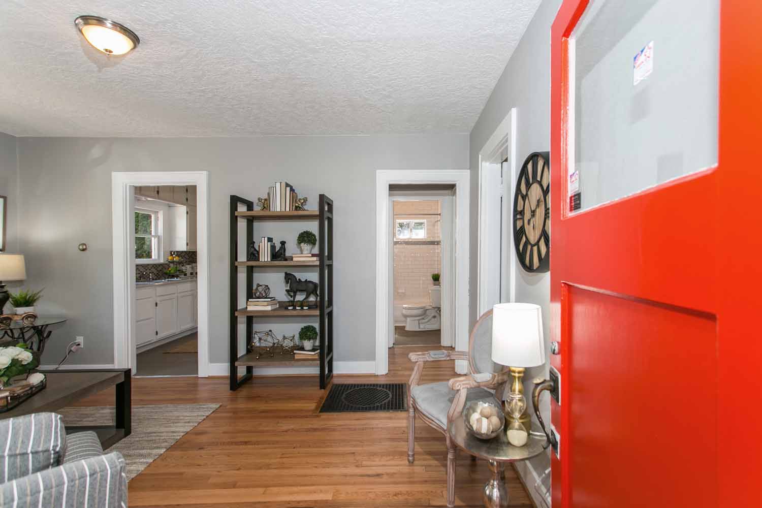
Stepping into the foyer on the left you are greeted with a spacious, (for a SE Portland bungalow), living room. The living room was small so it was important to not overcrowd the space. Instead our goal as professional home stagers was to create a consistent and functional flow throughout the space.
We decided to go with a cross between industrial and vintage with this home staging and the result was perfect for those adorable SE bungalows! The aesthetic honored the industrial, historical neighborhood without a doubt.
LIVING ROOM
In home staging, entering a home, you dont want to be greeted by the back of a sofa and this is a principle we abide by. This SE bungalow, inspired our professional home stagers to place the sofa against the wall to create a focal point with emphasis. The dark sofa against the neutral tones walls, (Paint color, Rock Candy by Sherwin Williams) creating stunning contrast and perfect balance.
Twig base side tables and plants add an organic element creating visual interest. Our home stagers complimented the light and airy neutral tones on the walls with neutral throw pillows against the dark sofa. The turnout was spectacular!
Styling bookshelves isn't always an easy task. The key is not to clutter the space but rather, create simple displays. Book ends create a focal point and visual interest. You can stack books vertically or horizontally by color. Flip them on their side and use them as risers to a curious item.
A playful centerpiece for the cocktail table is always a big hit! Using a tray as a frame for the centerpiece is a ways to make whatever you place in that tray stand out. Vary the scale of the items placed in the centerpiece to create a visual triangle and really making that centerpiece pop!
PROFESSIONAL HOME STAGING TIPS
Always select your focal point for a space first, and then build on the space from there. If your focal point is obvious upon entering a room you've nailed it because you've created an immediate resting place for the eye.
Staging psychology 101: Symmetry impacts the subconscious, and people find these spaces more restful and peaceful than asymmetrical layouts. Use the focal point of the space as the center point for your symmetrical layout design. Balance the weight of the room by using the same pieces on both sides of your focal point. Architectural elements sometimes prevent this from being a possibility for the layout, in which case you make seek for a consult by a professional home stager! We are here to help!
According to H. Camille Smith, rather than simply lining up items on a bookshelf, create small groupings that combine similar items in different sizes, colors and textures. Use stacks of books to elevate your favorite collectibles and add color. See more helpful tips for decorating bookshelves and mantles here.
Style your coffee table like a pro. You could create a display of your favorite collection, or use a simple throw over an ottoman. Whatever you choose, minimal is key for creating balance. Adding a vase and some flowers is always a nice touch. Consider the scale of the items being placed in the space. Use books as risers to create balance with smaller items.

IRENE Tokstad
With a loving husband and three amazing kids, Irene is committed to serving and supporting fellow community families of all shapes and sizes by helping them realize their home vision with innovation, integrity and passion.
CONNECT WITH ME
Join our mailing list
KITCHEN & DINING
The dining nook was very small so we had to be careful about what we put in the space in an effort to not overcrowd it. We decided this 29" square table from Ikea was perfect! It was a last minute decision that paid off big time! It fit like a glove in this cozy space!
In the kitchen we had a pretty blank canvas above the stove. Fortunately, we brought some extra metal wall art that fit perfectly in this awkward space. The scale of the art created a beautiful focal point for the prospective buyers eye.
PROFESSIONAL HOME STAGING TIPS
A breakfast nook is designed for an intimate meal for 2-4 people. Consider built in benches for storage and don't overcrowd the space. By creating a cozy breakfast nook in your home, you're more likely to sit there and enjoy your chosen breakfast each morning.
When considering what to put above your stove consider function first. If you cook, you know that oil splashes. You may not notice it at first, but it does build up over time, even if you have a fan. I've seen some grimy microwaves and shelves placed above the stove. Good news! Metal is easy to clean! Whether you are choosing a rack for cooking utensils or shelves or even metal farmed art like you see here, consider how easy maintenance will be.
MASTER BEDROOM
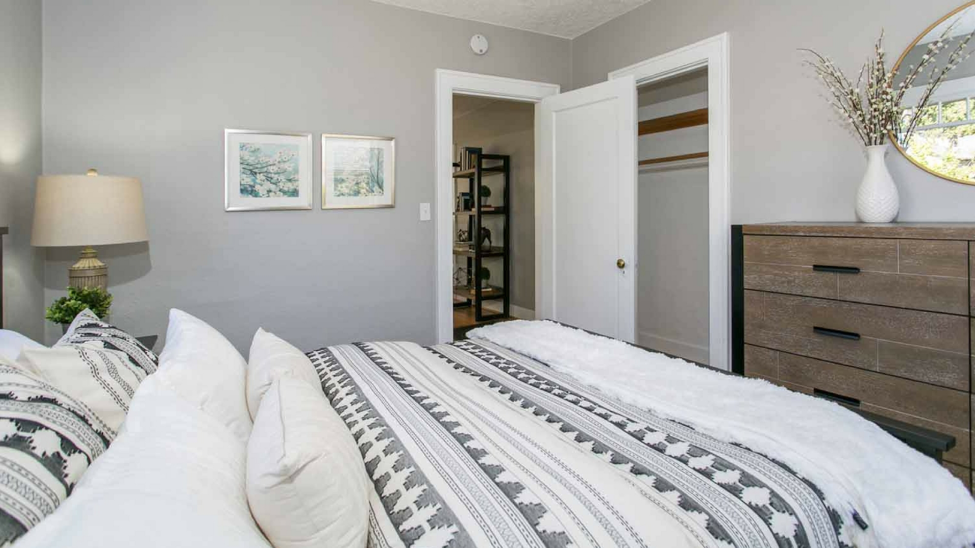
In the master bedroom our home stagers wanted to honor the story and flow of the rest of the house. We centered the space with a vintage rug, added texture with the bedding, (which became the focal point because it is so beautiful!), and created visual interest with groupings on the nightstands. The turnout was stunning! Who loves the mirror above the dresser?!! Hello Target!
PROFESSIONAL HOME STAGING TIPS
When preparing your home for sale, simple groupings such as a lamp, some books and a plant can create the perfect setting for a staged home. In professional home staging, we recommend groupings of odd numbers. Whether thats 1, 3 or 5 it seems to always photograph well, especially when placed close together.
KIDS BEDROOM
In the kids bedroom our home stagers wanted to feature plenty of playing space. Generally a white rug is ok because prospective buyers usually remove their shoes, in reality, a white rug may not be the best option for a kids room because lets face it, it could get messy!
P.S. Once we de-staged this house, we found that this white rug was no longer usable. (They could have removed their shoes!!!)
One of my favorite toys to stage with is that wooden rocking chair! Its playful and always sets the perfect stage for a playful bedroom.
PROFESSIONAL HOME STAGING TIPS
When designing a kids bedroom, consider neutrals elements that can grow with your child over time. Kids are constantly growing and changing their style. It can get very expensive constantly having to re-paint. Bold colors are trendy and often go out of style just as fast as our kids change their minds. Instead, choose a neutral tone for the walls and use bold colors with accents such as drapes and bedding. That way later on, when the kids have a new favorite color, its easy to swap accent decor out with a quick trip to HomeGoods. (Who are we kidding, maybe not that quick!)
THANK YOU
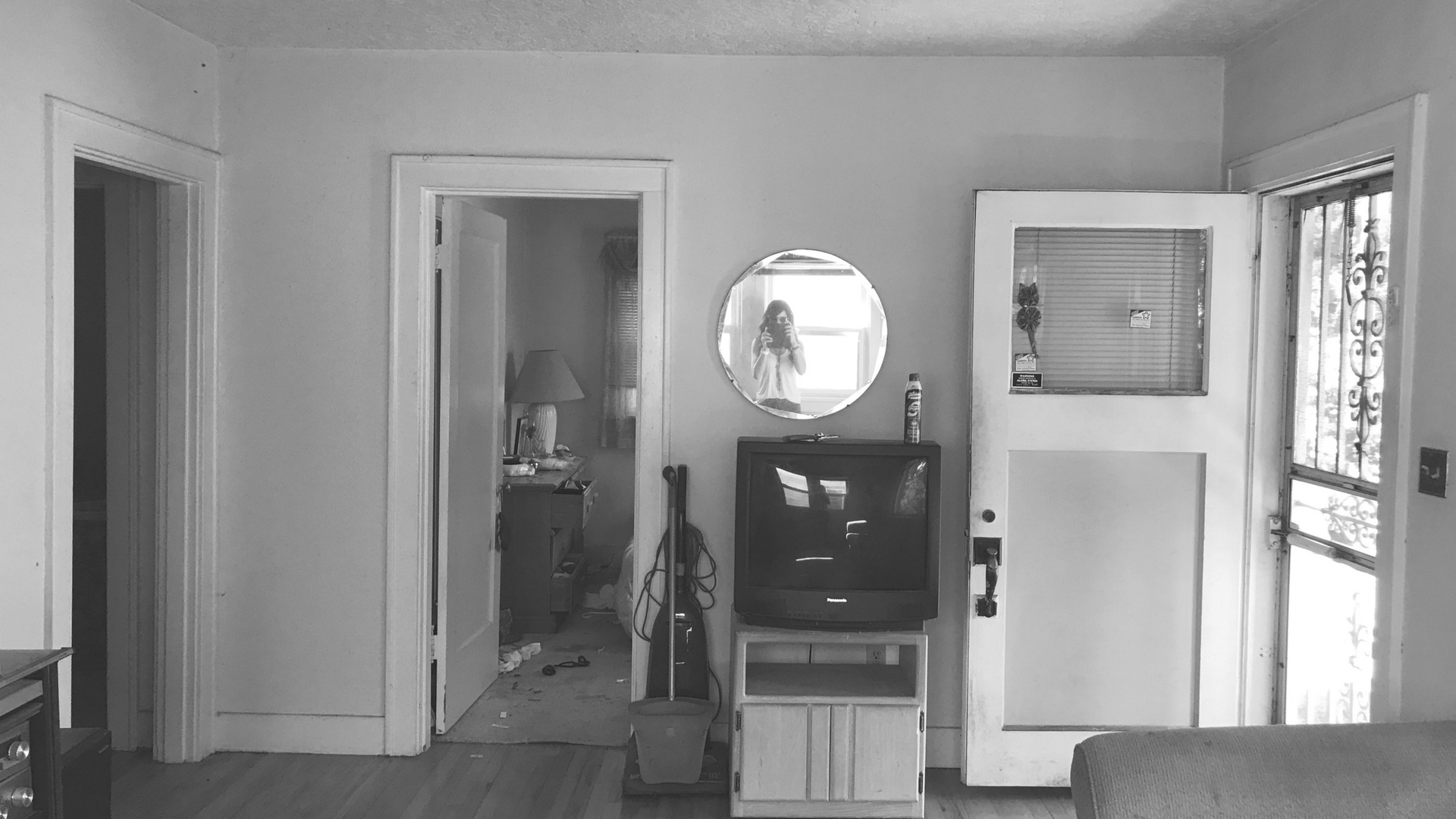
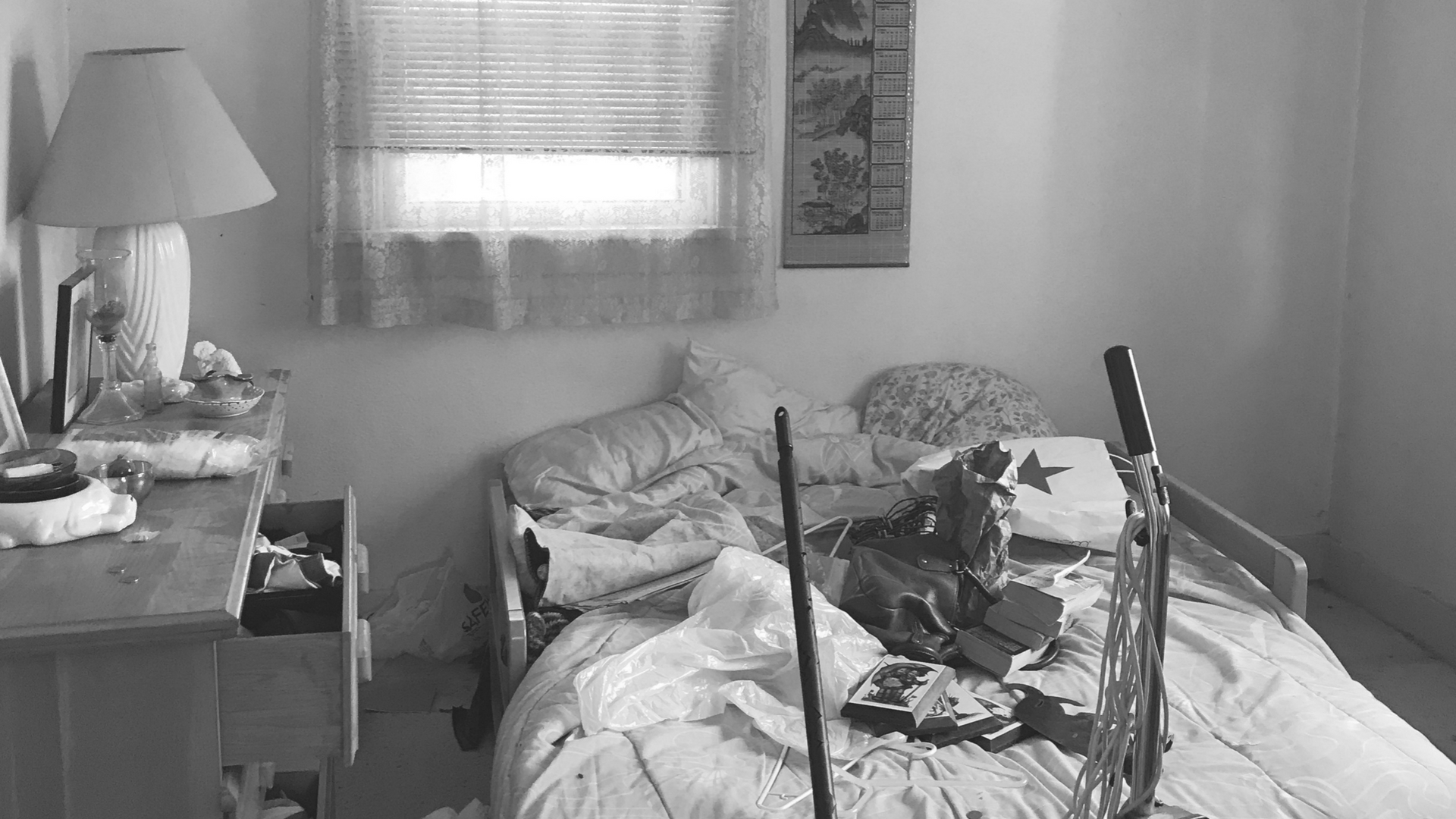
This staging was extremely rewarding considering where we started from. (Aren't those before pictures awful?!) Our home stagers transformed this house into a home and it was a fabulous success! The house sold within 2 days on the market over asking. Welcome home to the new homeowners! Thank you so much for reading this blog about our project and feel free to check more out here.
Stay up to date on the latest trends & tips
FOLLOW US ON SOCIAL MEDIA
Get the latest updates on hot trends, tips and tricks and short stories of our projects!


