Principles and Elements of Interior Design | Part 2
Welcome to the principles and elements of interior design part 2! Thanks for reading further! As you know these principles of interior design are essential methods and tools for designing spaces. In the last article we highlighted the 8 elements that, when implemented properly create stunning interiors just like Chip and Joanna Gaines! As always, it is best to abide by these interior design principles while also incorporating the elements so that you too can create stunning interiors that sweep people off their feet!
In this article we will discuss the 5 principles of design: balance, emphasis and focus, rhythm, proportion and harmony and unity. You can read about the elements of interior design here.
My approach to this defining task is the same as before, through the use of examples featuring Jonna Gaines design work from HGTV's, Fixer Upper, followed by a brief description of each principle design as well as how it was implemented and why it made it difference!
SYMMETRICAL BALANCE PRINCIPLE
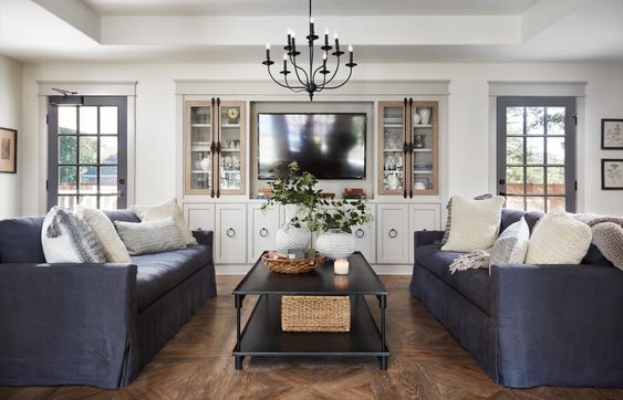
This image is from Fixer Upper Season 5 Episode 10.
This traditional living room features a symmetrical design by mirroring each side of the space. If we were to split this space in half, the two sides would be equal.
People find this principle of design pleasing because it reflects the human form; so naturally, one likely would feel comfortable in this balanced setting.
ASYMMETRICAL BALANCE PRINCIPLE
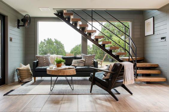
This image is from Fixer Upper Season 5 Episode 9.
This contemporary and small living space features an asymmetrical design. Chip and Joanna Gaines created balance in this small space by through the use of an asymmetrical design. Through the use of this principle the space becomes more casual and lively while maintaining balance. Way to go Chip and Joanna!
RADIAL BALANCE PRINCIPLE
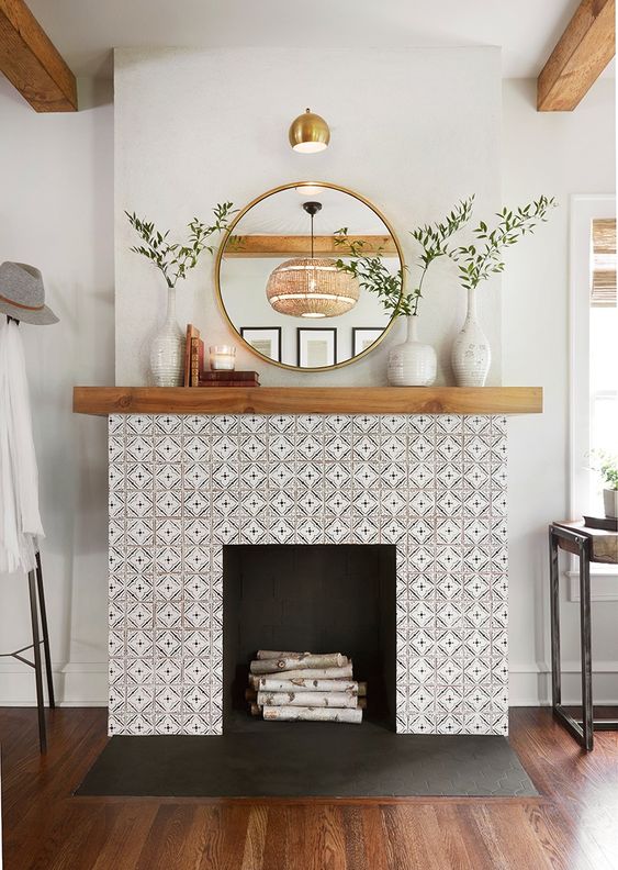
This image is from Fixer Upper Season 5 Episode 5.
In this living room design we see that all of the elements displayed in this fireplace form a center point. Because of the architectural emphasis through the tile work and mirror, this image could also be a wonderful example of asymmetrical balance. As always, a stunning design by Joanna Gaines!
architectural balance principle
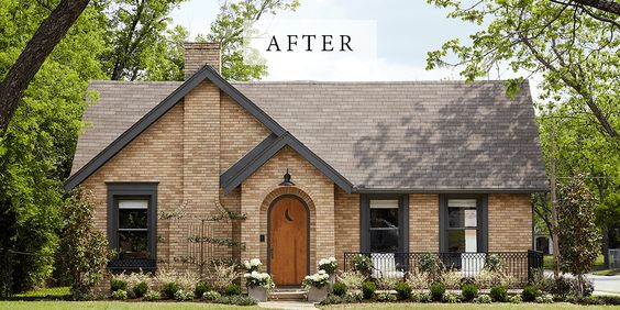
This image is from Fixer Upper Season 5 Episode 1.
Architectural emphasis has to do what the things typically do not change in the home. This include the exterior, beams, doors, windows and more. On the exterior of this home we see the chosen focal point is of course architectural influence. The beautiful arched door and vaulted ceilings add drama to this incredible home. The darker trim makes the windows pop and the simple landscaping truly sets the space off as a whole!
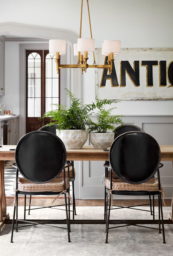
EMPHASIS PRINCIPLE
This image is from Fixer Upper Season 5 Episode 4.
In this space we see this vintage sign that draws attention to this incredible dining room. Personally, I find the space alluring and wish I could step into the room just by looking at the photo. The pop of brass in the chandelier really sets it off tying in the shadow color int he vintage sign. The industrial dining chairs made of iron compliment this vintage sign as well creating a perfect equilibrium.

IRENE Tokstad
With a loving husband and three amazing kids, Irene is committed to serving and supporting fellow community families of all shapes and sizes by helping them realize their home vision with innovation, integrity and passion.
CONNECT WITH ME
Join our mailing list
- « Previous
- 1
- …
- 4
- 5
- 6
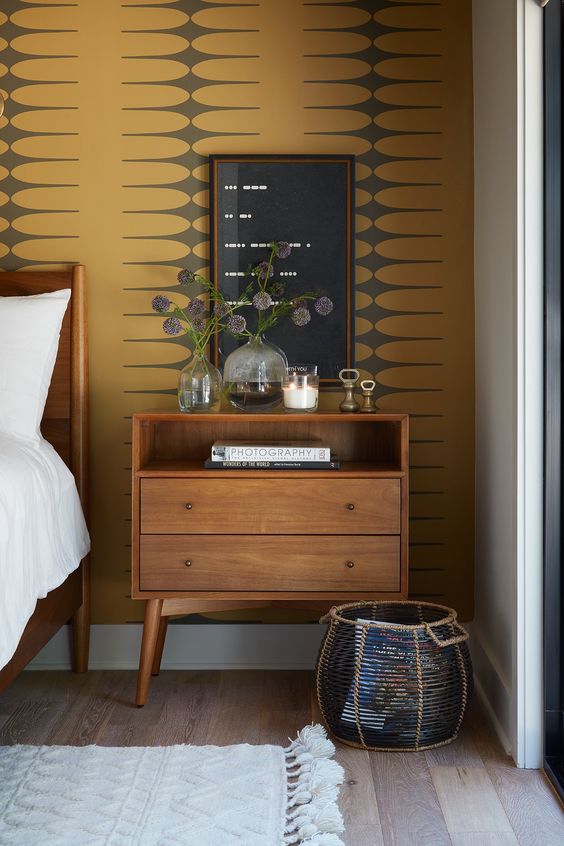
Rhythm Principle
This image is from Fixer Upper Season 5 Episode 6.
In this space, the featured wall paper pattern creates a repetition rhythm. When looking at the picture, your eyes naturally glide from one area to the next creating a natural flow, texture and visual interest while still accomplishing a sense of harmony in the space. Isn't this stunning?!
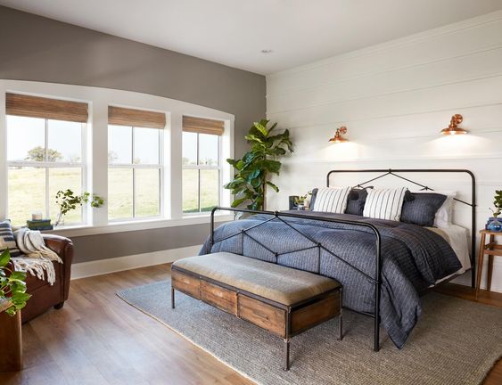
scale & proportion principle
This image is from Fixer Upper Season 5 Episode 14.
This space creates a balance through small scale furniture so as not to overcrowd the bedroom in this minimalist modern design. Due to the small scale of the bed, the weight of the accent wall creates balance making this cozy bedroom feel pleasing and proportioned. Without that shiplap and lighting, the wall may seem too bare and incomplete.
harmony and unity principle
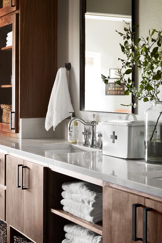
This image is from Fixer Upper Season 5 Episode 14.
This bathroom room features visual texture through the use of contrasting countertop and cabinets on the cabinets. In addition, the accent decor and plants add a natural element creating a sense of harmony. Every feature of the this space transitions together complimenting each other as a pleasing and consistent whole.
THANK YOU
Thank you so much for reading part 2 of this blog and we hope you found it relevant, inspiring and helpful! Now you know what goes into the works of implement the principles and elements of classic design and will be able to recognize that in great design.
Have you read about the elements of interior design? If not check out part 1 of this blog!
Stay up to date on the latest trends & tips
FOLLOW US ON SOCIAL MEDIA
Get the latest updates on hot trends, tips and tricks and short stories of our projects!

