Vacant Home Staging | North Portland Urban Living
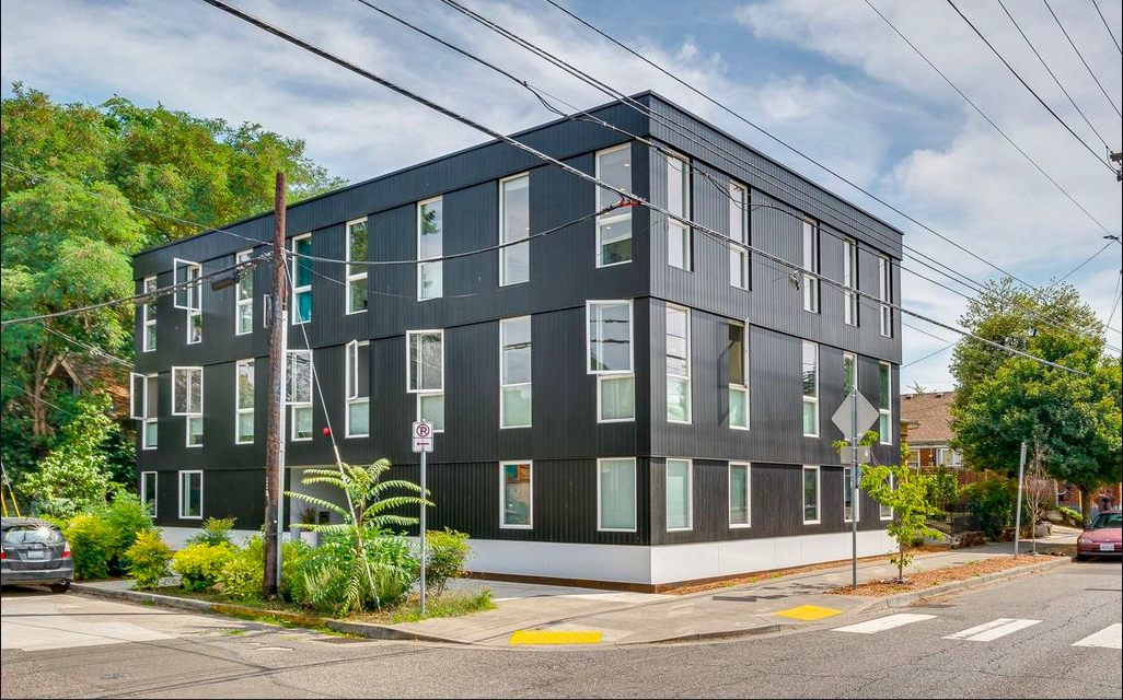
VACANT HOME STAGING | North Portland Urban Living
Ah, North Portland, such a wonderful place. We had the amazing opportunity to be apart of this Vacant Home Staging project and make this North Portland Condo look desirable and exciting to all potential buyers! A huge thank you and congrats to Julie Waters, our client and realtor on this home!
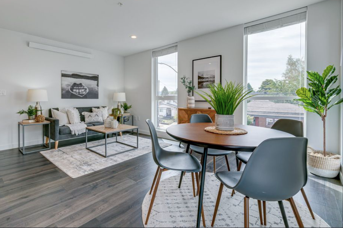
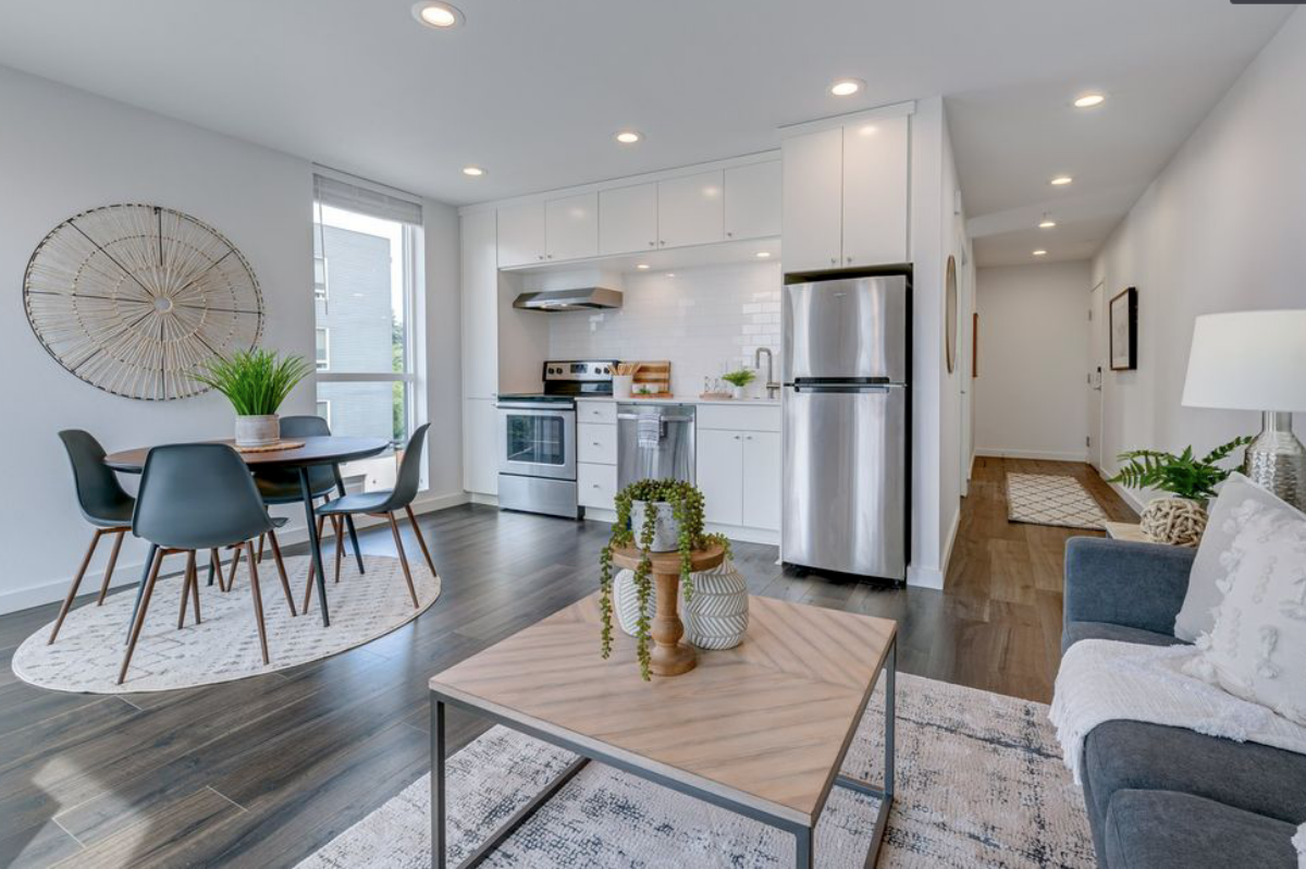
Our home staging experts' main goals were to showcase the home with a modern design, as well as the perfect starter home for a young couple or individual. To do this, our team configured the space in a functional yet comfortable way that helped all prospective buyers envision themselves in the space. Although just 477 square feet, our stagers created a spacious layout that was of course, beautiful as ever, but flowed perfectly!
In this article, we will be breaking down our Home Staging Process, room by room, while including our goals for each space, the elements within the design, and specifically how we configured each space in a chic and funcitonal way!
LIVING + DINING ROOM
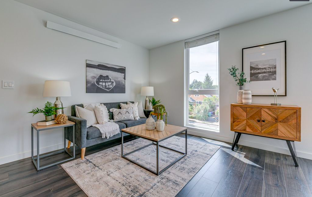
How beautiful is this great room!? Our team of professional home stagers chose a layout that created a functional living and dining area, without overcrowding the space. Using pieces such as the smaller sized sofa and the round, four seated dining table helped our team show prospective buyers that they can have a place to sit down and relax after a long day, or have a quiet dinner without feeling overcrowded in the space!
In addition, to compliment the architectural elements such as the gray washed floors and modern details, our stagers went with a modern design that featured cooler tones such as grays and blues, while keeping the design clean and sleek.
KITCHEN
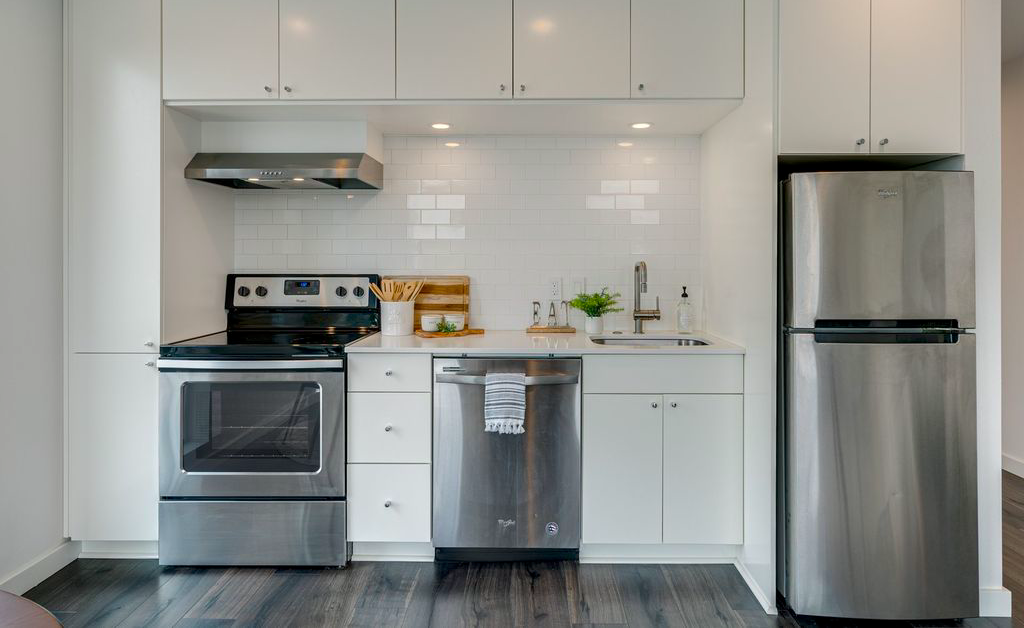
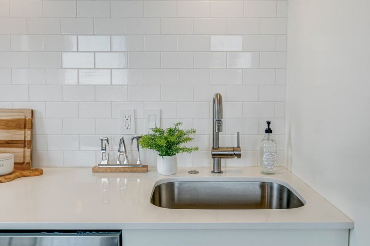
Small, but mighty! The key to the success of staging a kitchen of this size is to keep it simple! Our home staging experts went with a design that was minimal,yet practical. Everyday items such as the cutting boards, salt and pepper canisters, and utensils created that element of functionality without making the countertops seem overcrowded or busy.
Adding in smaller accessories such as the "eat" sign and greenery gave this kitchen that Design Allure touch, and let potential buyers know that you can in fact have a space that is both cute and practical!
MASTER SUITE
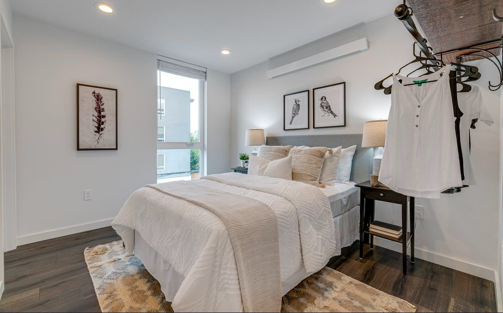
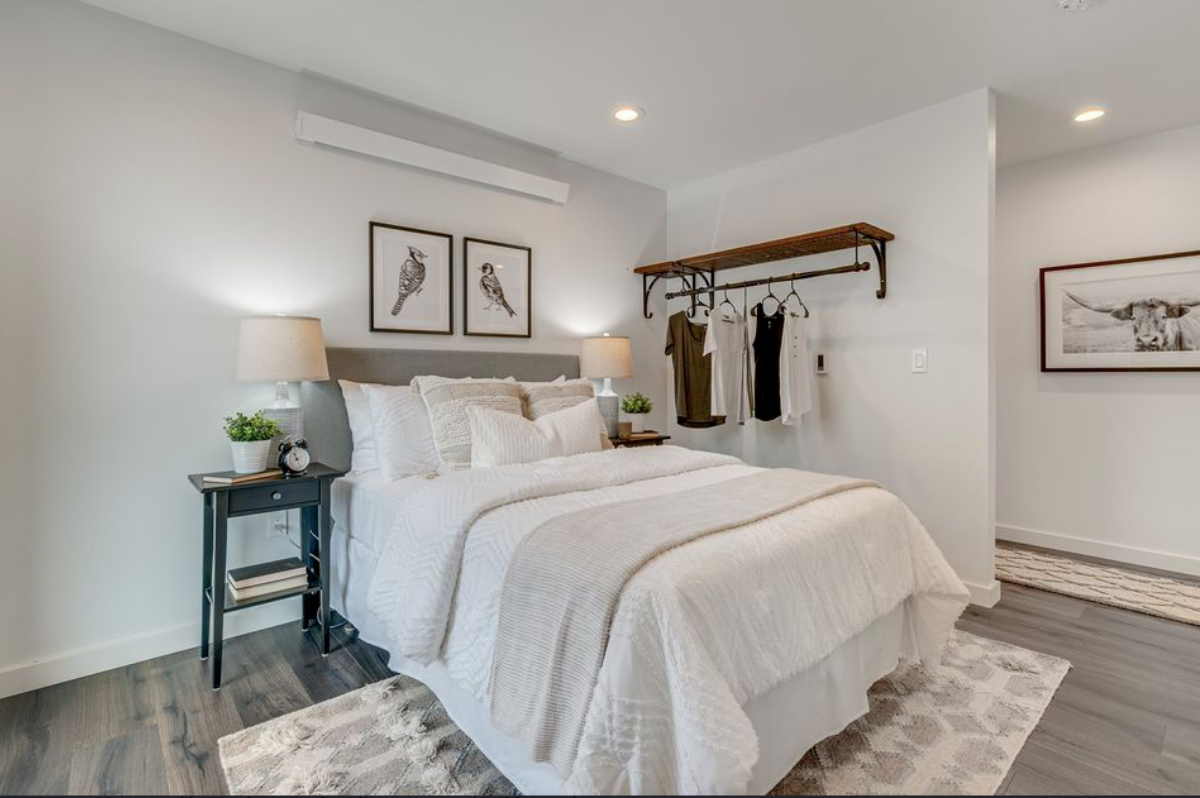
The last room in this beautiful North Portland condo is the quaint master suite. In this room, our stagers really wanted to help potential buyers envision this space as a bedroom that although small, could be perfect functionality wise!
To do this, our team curated a design that identified the luxurious and plush bed as the focal point of the space. In addition, because this room lacked space for a dresser, we used pieces of clothing to really showcase the chic and industrial shelving/clothing rack!
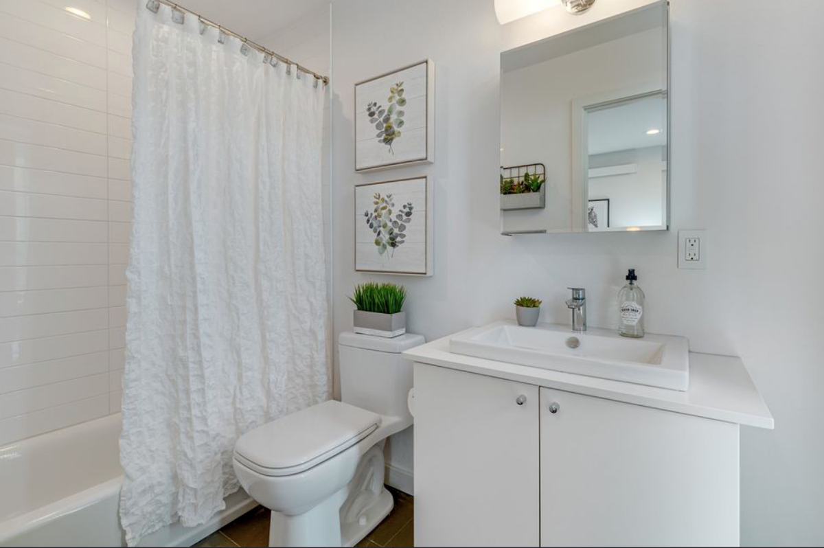
For the master bathroom, our team wanted to implement a design that was clean and spa like! Using pieces such as the cozy shower curtain and accessories such as the faux greenery gave the room a spa-like feel, and helped incorporate that desired organic element. Using wall art such as the botanicals are perfect to bring in color and simple designs for bathrooms!
THANK YOU
Thank you all for reading this week's article on this beautiful North Portland Condo ! Check out last week's Home Staging Blog on the amazing Hillsboro Family Home! To get inspired, check out our Pinterest page!

IRENE Tokstad
With a loving husband and three amazing kids, Irene is committed to serving and supporting fellow community families of all shapes and sizes by helping them realize their home vision with innovation, integrity and passion.
CONNECT WITH ME
Join our mailing list
- « Previous
- 1
- …
- 3
- 4
- 5
